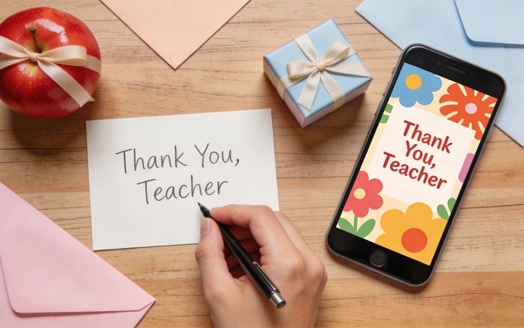
More Than Just “Thanks”: How to Thank Your Coach Properly
The season is over, a personal best has been smashed, or a life-changing goal has been reached. In the glow of achievement, there’s usually one person in the background who helped make it happen. Your coach. And when it’s time to write a coach thank you message, it's common to hit the same wall. “Thanks for everything” is true, but it feels too small for the effort, patience, honesty, and time they gave you.
A strong thank-you message doesn’t need to sound poetic. It needs to sound specific. Coaches notice when you mention the moment they steadied you after a bad performance, the habit they helped you build, or the standard they refused to let slip. That’s what makes appreciation land.
This guide gives you 8 message examples for different situations, from formal head coach notes to quick texts and more personal messages for life coaches. Each one includes the strategy behind it, so you’re not just copying a template. You’re choosing the right tone for the relationship, setting, and outcome.
If your coach’s role stretched beyond drills and direction, it often helps to reflect on their wider essential coaching responsibilities, then build your message from there.
1. The Formal Appreciation Message for Head Coaches
When you’re thanking a head coach, warmth matters, but structure matters more. This is the version you use at an end-of-season dinner, in a printed program, in a club email, or alongside a coordinated team gift. The tone should be respectful, composed, and specific.
What doesn’t work is overdoing emotion or sounding casual. A head coach usually carries leadership, selection pressure, conflict management, and standards for the entire group. Your message should reflect that scale.
A polished example
Dear Coach Michael Harris,
On behalf of the team and our families, thank you for your leadership, commitment, and professionalism throughout the season. Your preparation, consistency, and belief in the group shaped far more than our results. You created a standard that pushed everyone to improve.
We especially appreciate the way you led during difficult moments, stayed composed under pressure, and gave each player clarity about their role. Your guidance helped the team grow in confidence, discipline, and resilience.
Thank you for the time and energy you gave so generously. Your influence will be remembered long after the season ends.
With sincere appreciation, The Players and Families
Why this format works
It names leadership first. That’s the correct emphasis for a head coach. It also avoids the common mistake of turning the note into a rambling speech draft.
Use this structure:
Start with role and respect: Use their proper title and full name.
Name the leadership impact: Mention standards, direction, culture, or decision-making.
Add one concrete example: Pressure handling, player development, or communication.
Close collectively: Especially if the message comes from a team, committee, or parents’ group.
Practical rule: Formal doesn’t mean cold. It means controlled.
If you’re coordinating several messages for a ceremony or keepsake, draft them in one place first, proof them aloud, and cut repeated phrases. Formal appreciation lands best when every sentence earns its place.
2. The Personal and Warm Thank-You for Individual Coaches
This version suits the coach who changed something personal for you. Maybe a fitness coach helped you rebuild confidence after a hard year. Maybe a junior sports coach gave your child belief they didn’t have before. Maybe a mentor coach kept you steady when you were ready to quit.
A personal coach thank you message should sound like a real person wrote it. Not a committee. Not a greeting card.
A message with heart
Hi Sarah,
I just wanted to say thank you for everything you’ve done for me over the past few months. You didn’t just help me improve physically. You helped me trust myself again.
I still remember the session where I was frustrated and ready to give up, and you calmly reminded me that progress isn’t always loud. That stuck with me. Since then, I’ve approached challenges very differently, not just in training, but in everyday life as well.
Thank you for being patient, encouraging, and honest. Your support has meant more to me than you probably realise.
Why this one feels genuine
It focuses on one emotional truth. That’s the difference between moving and mushy. If you try to thank someone for everything all at once, the message usually gets vague.
Keep these points in mind:
Mention a turning point: One conversation or session is stronger than broad praise.
Say what changed in you: Confidence, discipline, perspective, calm.
Keep the language natural: Write how you’d speak, just slightly cleaner.
Save the message somewhere meaningful: EasyRegistry’s gift registry process can help keep personal notes attached to a shared celebration or contribution, rather than losing them in scattered texts.
If you’re a parent writing on behalf of a child, keep the same principle. Don’t just thank the coach for “all the hard work”. Thank them for a visible difference in your child’s attitude, confidence, or commitment.
3. The Group Recognition Message for Multiple Coaches
Thanking a full coaching staff is harder than thanking one person. You need to sound inclusive without becoming bland. If the note praises everyone in exactly the same way, nobody feels seen. If it singles out one or two people too heavily, the rest of the staff can feel like an afterthought.
The fix is simple. Name the group first, then add a line of distinction.
A team-based example
To Coaches Ben, Aisha, Daniel, and Priya,
Thank you for everything you’ve each contributed this season. As a coaching team, you brought structure, encouragement, accountability, and care to every session and every match.
Coach Ben, thank you for setting clear standards and leading with consistency. Coach Aisha, thank you for your calm feedback and the way you helped players reset after mistakes. Coach Daniel, thank you for your energy and attention to detail. Coach Priya, thank you for always making players feel supported and prepared.
We’re grateful not only for what you taught us individually, but for how well you worked together. That unity gave the whole team confidence.
With thanks, The Team
How to avoid the usual group-message mistakes
The message should read like one voice, not four separate mini-speeches stitched together. Keep each individual mention balanced in length and tone.
Use a shared system if multiple parents or players are contributing thoughts. A central page such as EasyRegistry’s online gift registry is useful when one organiser needs to gather names, messages, and contributions without chasing everyone separately.
Group messages work best when they recognise different strengths inside one shared effort.
A good real-world use case is an end-of-season gift where each family contributes a short note. The organiser can edit for consistency, remove duplicates, and build one polished statement that still feels personal.
4. The Gratitude Message for Volunteer or Pro-Bono Coaches
Volunteer coaches deserve a different kind of acknowledgment. Paid professionals give expertise. Volunteer coaches often give expertise plus early mornings, late nights, travel, admin, and emotional labour that no invoice reflects.
That’s why a thank-you note here should explicitly recognise generosity. Don’t imply it. Say it.
A message that honours the sacrifice
Dear Coach Emily,
Thank you for the time, care, and energy you’ve given to our community programme. Your commitment has never felt routine. It has felt generous.
You showed up consistently, encouraged every participant, and created an environment where people felt welcome to learn and improve. That matters even more when the work is given freely.
Please know that your contribution has made a real difference to the players and families involved. We’re grateful for the example you’ve set and for the community you’ve helped build.
With sincere thanks, The Families
What to include when the coach volunteered
This is one place where naming effort directly is powerful.
Acknowledge unpaid contribution: Say “volunteered”, “gave your time”, or “offered your support so generously”.
Name the broader effect: Community confidence, belonging, access, consistency.
Recognise reliability: Showing up every week is often the greatest gift.
Pair words with action: If you’re organising a group thank-you, EasyRegistry’s free registry option can help collect a practical gift and combine messages in one place.
If you know the coach covered equipment, transport, or extra preparation out of goodwill, mention it carefully and respectfully. Specific recognition is often more meaningful than a longer note.
5. The Achievement-Focused Thank-You for Performance-Based Coaching
The scoreboard has changed. The race time dropped, the team qualified, or the skill finally held up under pressure. That is the moment for an achievement-focused thank-you message.
This version works best when a coach’s input clearly shaped a measurable result. The key is not to praise the outcome in isolation. A strong message links the result to the coach’s decisions, standards, and teaching. That makes the note feel earned instead of ceremonial.
A sharper results-led example
Coach Liam,
Thank you for helping me reach this milestone. The result reflects more than one good day. It came from your planning, your honest feedback, and your standard of getting the basics right every session.
You knew when to push harder, when to strip things back, and when to remind me to trust the work we had already done. That changed how I train and how I compete.
I’m proud of the result. I’m even more grateful for the process behind it. Thank you for helping me build something repeatable, not just memorable.
Why this message works
Performance-based thank-you notes are stronger when they show the chain between coaching and outcome. That usually means naming one concrete shift: better pacing, more disciplined preparation, smarter recovery, cleaner technique, or steadier decision-making under pressure.
Research on coach-athlete relationships has linked supportive communication with stronger motivation, wellbeing, and team functioning in sport settings (International Journal of Sport and Exercise Psychology study). For a thank-you message, the practical takeaway is simple. Generic praise is easy to forget. Specific recognition shows the coach what was important.
Use that principle in one of three ways:
Method recognition: “Your feedback on pacing changed the way I competed.”
Process recognition: “You taught me how to train with purpose, not just intensity.”
Pressure recognition: “You kept me steady when the result still felt a long way off.”
A common mistake is writing the note like a match report. Scores and rankings have a place, but they are rarely the most meaningful part of the message. Coaches usually remember the line that proves you understood what they were trying to teach.
If you are sending this after a season, tournament, or qualification milestone, collect a few specific details before you write. One breakthrough, one habit, and one result is usually enough. If a team or family group is contributing messages or a shared gift, organise those details first so the final thank-you feels consistent rather than repetitive. Tools like EasyRegistry can help keep that practical side tidy while the message itself stays personal.
6. The Mentorship and Development-Focused Message for Life Coaches
You finish a period of coaching and realise the biggest result is hard to summarise in one line. There is no medal, season record, or final score. What changed is quieter and often more important. Better decisions. Clearer boundaries. More confidence. A stronger sense of direction.
That is why thank-you messages for life coaches need a different strategy from sports-focused notes. The message works best when it names a shift in thinking, behaviour, or self-trust. If you only thank them for being supportive, the note stays polite but vague. If you identify the change their coaching helped create, the message feels earned and memorable.
A message for personal growth coaching
Hi Natalie,
Thank you for your guidance during a period of life that felt uncertain and heavy. Your coaching helped me slow down, get honest about what I wanted, and make decisions with more clarity.
What I appreciate most is the way you asked questions that made me think for myself. You helped me trust my own judgement instead of looking for outside approval.
I still use the mindset tools we worked on, especially when I feel pressure or start second-guessing myself. Your coaching has changed how I think, how I work, and how I show up for other people.
Why this type of message works
A good life coach thank-you message focuses on development, not event recap. The core point is personal change.
In practice, the strongest notes usually include three parts:
The starting point: uncertainty, burnout, indecision, low confidence, or a major life transition
The coach's contribution: better questions, accountability, structure, perspective, or practical tools
The lasting effect: clearer choices, healthier habits, stronger boundaries, or more trust in your own judgement
That structure keeps the message specific without forcing you to disclose private details. It also helps if the thank-you is going into a card, email, or shared gift where space and tone matter.
The strongest message for a life coach names a change in how you think or act.
Use that rule to judge what to include. A milestone birthday, career move, recovery period, or personal reset can all prompt this kind of note, but the milestone is only context. The substance is the internal development that followed.
There is also a practical trade-off here. Private messages can be more candid. Public messages should protect personal boundaries. If you are organising a group contribution or sending appreciation alongside a gift, gather comments first, remove anything too intimate, and keep the final wording focused on the coach's impact. Tools like EasyRegistry help with that coordination so the logistics stay organised and the message still sounds personal.
7. The Brief and Practical Thank-You for Quick Acknowledgement
Not every thank-you needs to be long. Sometimes the right move is a clear, timely message sent while the moment is still fresh. After a final game, a coaching session, or an event wrap-up, a short note can be exactly enough.
The mistake people make is confusing short with generic. “Thanks coach” is polite. It’s also forgettable.
A good short version
Thanks for today, Coach. Your feedback before the session helped me settle in and focus on what mattered. I really appreciate the time and attention you gave me.
Or:
Thank you for all your support this season. You pushed us, backed us, and kept standards high. We learned a lot from you.
How to make brief messages still feel considered
Use one detail. That’s the whole trick. One detail turns a routine courtesy into a real coach thank you message.
Keep the format simple:
Open directly: “Thank you for today” or “Thank you for this season”.
Add one concrete reference: A reminder, a drill, a conversation, or a standard.
Close with appreciation: “I really appreciate it” or “I’m grateful for your support.”
This format works well for text, email, or a quick message attached to a group contribution after an event. If you think the coach deserves more, send the short note now and a fuller message later. Prompt gratitude beats perfect gratitude that never gets sent.
8. The Inclusive Thank-You Message for Adaptive and Specialised Coaching
Adaptive and specialised coaches often do everything strong coaches do, plus they tailor communication, pacing, environment, and expectations to the person in front of them. A thank-you note here should recognise both excellence and adaptation without sounding patronising.
Keep your language respectful and person-led. If the athlete or family uses person-first or identity-first language, follow their preference. If you’re unsure, choose plain, respectful wording and focus on the coach’s specific support.
A thoughtful example
Dear Coach Rachel,
Thank you for the skill, patience, and care you’ve brought to every session. You created an environment where progress felt possible, expectations stayed high, and support was always there when needed.
We especially appreciate the way you adapted your coaching to suit individual needs without ever lowering belief in what could be achieved. That balance of flexibility and excellence made a lasting difference.
Your work has helped build confidence, enjoyment, and real growth. Thank you for coaching with such professionalism and respect.
What to mention and what to avoid
This style benefits from precision. Name the helpful approach, not just a vague idea of kindness.
Useful angles include:
Specific accommodation: Clearer instructions, sensory awareness, modified drills, pacing, or communication style.
Respectful standard-setting: “You expected real effort and made success accessible.”
Belonging: “You made participation feel normal, valued, and fully part of the team.”
A strong real-world example is a parent thanking a coach who helped a neurodivergent child feel settled enough to participate consistently, or an athlete recognising an adaptive coach who made technical adjustments that enabled confidence and performance.
Respect shows up in detail. If you mention inclusion, mention what the coach actually did.
8-Point Comparison of Coach Thank-You Messages
Message Type
Implementation Complexity ?
Resource Requirements ?
Expected Outcomes ?
Effectiveness/Quality ?
Ideal Use Cases & Key Advantages ?
The Formal Appreciation Message for Head Coaches
Moderate, needs careful, polished wording
Low–Moderate, drafting, proofreading, possible printing
The Inclusive Thank-You Message for Adaptive & Specialised Coaching
High, requires sensitive, informed language
Moderate, research preferred terminology and accommodations
Validation of specialised expertise and strengthened inclusion
High ?, deeply meaningful when appropriately worded
Adaptive sports, inclusive programs, validates expertise and accessibility efforts
Streamlining Gratitude with Smart Tools
The failure point is rarely intention. It is coordination.
A season ends, ten families want to contribute, three people draft messages in different group chats, one person collects money, and nobody is sure which note will reach the coach. The result is usually a decent thank-you delivered late, with missing names, uneven wording, and extra admin that drains the goodwill out of the process.
A shared system fixes that. EasyRegistry works well when appreciation involves a group, a gift, and multiple messages that need to be gathered in one place. That is especially useful after a season, tournament, fundraiser, milestone birthday, baby shower, or community event. Instead of chasing contributions in one app and comments in another, you can organise the occasion, track participation, and keep the written notes attached to the gift.
That practical structure changes the quality of the final message. Group appreciation is stronger when someone can see who has contributed, what each person wants to say, and where the gaps are before anything is sent. In practice, this helps avoid the two problems I see most often. Generic wording, and good intentions that never get finalised.
If you are writing with help from a tool, use it for refinement, not for the substance of the message. A tool like this AI tool to rewrite messages tone can help adjust formality, warmth, or brevity after the core note is written. Start with core detail first. Software can improve tone, but it cannot supply lived experience.
The strategic benefit is simple. Better systems produce better follow-through.
For coach thank-you messages, that usually means three things. The note gets sent on time. The wording stays specific. The group process stays organised enough that the final message feels deliberate rather than pieced together at the last minute.
EasyRegistry also suits the way appreciation occurs in groups. Some people want to give money, some want to write a few thoughtful lines, and some want both. Keeping those actions together makes it easier to turn scattered responses into a card, a printed keepsake, or a polished digital message that reflects the full group properly.
If you’re organising a coach gift, collecting group messages, or want one easy place to manage contributions and follow-up, EasyRegistry makes the whole process cleaner and less stressful. Set up a registry, gather heartfelt notes from everyone involved, and turn scattered appreciation into one thoughtful, well-organised thank-you.
It’s the last week of term. The lunchboxes are nearly done for the year, the concert uniform is still draped over a chair, and there’s a blank card on the kitchen bench waiting for someone to write in it.
That moment catches a lot of parents out. You know you want to say thank you. You know the teacher has mattered. But turning a whole year of patience, effort, emails, encouragement, and classroom care into a few lines can feel oddly difficult.
After years of helping organise class gifts and end-of-year cards through school communities, I’ve learned that thank you cards for teachers don’t need to be polished to be meaningful. They need to be specific, warm, and honest. And when the gift is from a whole class, they also need a bit of coordination so the organiser doesn’t end up chasing money, signatures, and messages at the worst possible time of year.
Why a Simple Thank You Matters More Than You Think
A teacher might receive plenty of noise in a week. Notes about absences. Questions about homework. Permission slips. Last-minute reminders. What they often don’t receive is clear, personal appreciation.
That’s why a simple card can land so strongly. It doesn’t have to be expensive. It doesn’t have to be long. It tells a teacher that someone noticed the daily work that usually disappears into the routine of a school term.
Gallup research shows that consistent recognition can improve teacher productivity and retention, yet only about 25% of teachers feel they receive praise or recognition on a weekly basis in Gallup’s article on why appreciating teachers is important. That stat isn’t about cards specifically, but it does explain why even a small gesture matters.
What teachers tend to remember
The cards that stick aren’t always the fanciest ones. Usually, they’re the ones that mention something real.
A parent writes that their child stopped dreading maths. A student thanks a teacher for making school feel safe. A family mentions the extra care shown during a rough patch. Those details tell the teacher their effort reached someone.
A short note with one real memory usually means more than a long message full of general praise.
Why the card often matters more than the gift
When parents are choosing both a gift and a card, the card can feel like the add-on. In practice, it’s often the part a teacher keeps.
That’s especially true with class gifts. The shared present is lovely, but the written message gives it emotional weight. If you’re pairing a card with something more personalized, curated guides like these gifts for music teachers can help when you’re buying for a specialist teacher and want the present to feel thoughtful rather than generic.
For many families, the hardest part isn’t deciding whether to say thank you. It’s finding words that don’t sound copied, awkward, or too vague. That’s where a simple structure helps.
Crafting a Message That Resonates
Overcomplicating this is common. A card doesn't need to sound profound. It doesn’t. The strongest thank you cards for teachers usually do three things well. They open warmly, mention something specific, and close with generosity.
Start with warmth, not formality
You don’t need to sound like you’re writing a speech. A natural opening works better than a stiff one.
Try language that sounds like you:
From a parent: Thank you for all the care you’ve shown this year.
From a student: Thanks for making your class feel welcoming.
From a group: We wanted to thank you for everything you’ve given our class this year.
What usually falls flat is language that could be addressed to absolutely anyone.
Use: “Thank you for helping Sam settle in so gently at the start of the year.”
Avoid: “Thank you for your dedication and commitment.”
The second line isn’t wrong. It’s just interchangeable. If your note could be copied into ten cards without changing a word, it probably needs one more personal detail.
Put one specific memory in the middle
This is the part that makes the card feel real. Don’t try to summarise the entire year. Pick one moment, one habit, or one change you noticed.
That detail might be academic. It might be emotional. It might even be funny, if you know the teacher well enough for that tone to work.
Good specifics often come from questions like these:
What changed for my child this year? Maybe they became more confident reading aloud or less anxious about school.
What did the teacher do that helped? Think about patience, structure, encouragement, feedback, or calm handling of a difficult patch.
What moment still gets mentioned at home? That’s often your best clue.
Keep the middle concrete
Specificity doesn’t mean writing a novel. One or two grounded sentences are enough.
Here are examples of the kind of detail that works:
Academic growth: You helped Ava stop saying “I’m bad at writing” and start having a go.
Confidence: We noticed how much more comfortable Noah became speaking up in class.
Care: Thank you for how gently you handled the tough start to term.
Interest sparked: Ella came home talking about science in a way we hadn’t seen before.
The best line in the card is often the one only your family could write.
End with appreciation and a human closing
The final line should leave warmth, not drift into clichés. Keep it simple and direct.
A few reliable closings:
We’re very grateful for the year our child had with you.
Thank you for the difference you’ve made.
We hope you have a restful break. You’ve earned it.
Our family will remember your kindness.
If your child is writing the card, let their own language stay in it. A slightly crooked sentence that sounds like the student is better than a polished paragraph that sounds borrowed.
What to avoid
Some messages miss because they try too hard. Others become bland because they say nothing concrete. A few things usually don’t help:
Overly broad praise: “You are the best teacher ever” is sweet, but stronger with a reason attached.
Too much humour: Joke lines can work, but only if the relationship supports it.
Backhanded compliments: Anything that starts with “Even though this year was chaotic…” can go sideways quickly.
A message written entirely by committee: Group cards still need one clear voice.
A good formula to keep in mind is this:
Warm opening + one specific example + gracious closing
That structure works whether the card is from a prep student, a high school family, or a whole class.
Message Ideas and Templates for Every Situation
Sometimes you don’t need a full script. You need a starting line that gets the pen moving. That’s where prompts help.
The strongest prompts give you a direction rather than a complete message. That matters because thank you cards for teachers feel warmer when they sound like the sender, not like a template library.
Teacher Thank You Message Starters
Sender Type
Focus
Example Snippet
Young child
Simple affection
“Thank you for helping me learn and for being kind to me.”
Young child
Favourite classroom moment
“I liked when we did painting and stories with you.”
Teenager
Feeling understood
“Thank you for treating us with respect and making your class feel comfortable.”
Teenager
Subject confidence
“You made this subject feel less intimidating, and that changed a lot for me.”
Parent
Academic growth
“We noticed how much more confident our child became with reading this year.”
Parent
Emotional support
“Thank you for helping our child feel settled, safe, and included.”
Parent
Specific challenge
“We’re grateful for the patience you showed during a difficult patch this term.”
Parent
Communication
“We appreciated how clearly and calmly you kept us informed throughout the year.”
Group of parents
Collective thanks
“From all of our families, thank you for the care and energy you brought to the class.”
Group of students
Shared classroom experience
“You made our classroom feel encouraging, organised, and fun to be part of.”
Specialist teacher
Niche impact
“Thank you for helping students enjoy your subject and feel proud of their progress.”
End of year card
Looking ahead
“Your impact will carry well beyond this school year.”
How to turn a snippet into a real message
A starter line is only the first piece. Add one detail and one closing, and the card is done.
For example:
Starter: Thank you for helping our child feel settled.
Add detail: The first few weeks were a big adjustment, and your calm approach made a real difference.
Close: We’re very grateful for the care you’ve shown all year.
That gives you a note that feels personal without taking ages to write.
Prompts that work well for group cards
Group messages need a different tone. They should sound collective without becoming bland. The easiest way to do that is to focus on shared experience rather than trying to speak on behalf of every individual family.
Collective gratitude: thank the teacher for what they gave the class as a whole
For group cards, write one central message in a clear voice, then let individual families add short personal notes around it.
That approach avoids the usual problem where the main message becomes vague because it tries to include everyone’s perspective at once.
Choosing Your Format Physical vs Digital Cards
The format changes the feel of the thank you. Neither option is automatically better. It depends on timing, age of the student, whether multiple people are contributing, and how much admin you want to carry.
Where physical cards win
A handwritten card still has a different kind of presence. If a young child has drawn on it, signed their own name, or added a little note in their own spelling, it often becomes a keepsake.
Physical cards work well when:
The message is personal: one family, one student, one teacher
The child wants to make something: drawings, stickers, cut-out shapes, handprints
You’re giving a gift in person: the card completes the gesture
You want emotional weight: handwritten notes tend to feel more intimate
The trade-off is practical. Physical cards are easy to forget, hard to circulate to a whole class, and awkward when people want to contribute from different locations.
Where digital cards make life easier
Digital cards are useful when speed and coordination matter more than paper. They’re also much easier for group thank-yous, especially when families need to add messages on different days.
Digital options suit situations like these:
Last-minute thanks: no shopping trip required
Class gifts: multiple contributors can add messages
Remote participation: grandparents, co-parents, or absent students can still contribute
Cleaner organisation: one link is easier than passing around a card folder
If you’re collecting both contributions and messages, a tool designed for that flow can reduce the back-and-forth. For families comparing card-and-gift options, the gift card registry page shows one example of how a shared link can simplify a group present.
Side-by-side trade-offs
Format
Strengths
Limitations
Best fit
Physical card
Personal, tactile, good for drawings and handwriting
Harder to coordinate for groups, easy to leave until the last minute
Can be messy, time-consuming, not ideal for class-wide input
Primary school children, family-made gestures
Digital card
Fast, easy to share, simple for multiple contributors
Can feel less personal if the message is generic
Group gifts, late organisation, distributed families
Email note
Immediate, practical, no printing needed
Less ceremonial, easier to dash off too quickly
Short sincere thanks when time is tight
Choose the format that makes it easier to send a good message, not the format that looks most impressive.
A rushed handwritten card with no thought in it isn’t automatically better than a carefully written digital one. The substance still matters most.
The Smart Way to Organise a Group Thank You Gift
Friday afternoon is when group teacher gifts usually come unstuck. One parent is asking for the bank details again, another wants to add a message after school pickup, three families meant to contribute but forgot, and the card is still blank.
That pile-up is why class parents dread organising a “simple” thank-you. The hard part is rarely choosing the gift. It is coordinating money, names, messages, deadlines, and last-minute changes without turning a kind gesture into admin.
The pattern is predictable because the weak spots are always the same:
Contributions come in unevenly: some families pay straight away, others need reminders, and a few only respond once the gift is already being bought.
Messages arrive across different channels: text, email, WhatsApp, pickup chat, or a photo of a note that still needs to be typed up.
One person ends up holding the whole job: even in a helpful class, the organiser usually becomes the collector, editor, treasurer, and reminder service.
The card gets left until the end: by then, everyone is focused on wrapping up the gift, so the wording feels rushed.
I’ve coordinated enough class presents through the P&C to know where the time goes. It is not the present itself. It is the follow-up. If the process is loose, the organiser spends more energy chasing people than shaping a thoughtful thank-you.
A good group card also needs structure. Without it, you get two common problems. The message sounds so broad it could go to any teacher, or it becomes a messy stack of unrelated mini-notes.
The cleanest approach is to split the writing in two:
Write one shared class message for the main thank-you.
Add short family notes only if parents want to include something personal.
That format works because it gives the teacher one clear message to read first, while still leaving room for specific comments from families who have a story or detail to add. It also makes editing much easier. The organiser is polishing one main note, not trying to stitch together twenty different writing styles into a single paragraph.
Gift choice matters too. A group present feels more genuine when it matches the tone of the card. If the class has chosen something personal, practical, or locally sourced, the thank-you message has a clearer reason behind it. For organisers who want an alternative to the standard mug-and-chocolates cycle, these teacher appreciation flower ideas can help.
For group collections, the smartest setup is one system for both money and messages. A shared page such as a free gift registry for teacher group gifts gives families one place to contribute and add their note, instead of sending payment details in one thread and collecting card wording somewhere else.
That is what keeps the gift feeling warm and organised. Less chasing, fewer missed names, and a final card that sounds like the class meant every word.
Streamline Your Group Gift with EasyRegistry
When a class gift needs contributions, messages, and a clear record of who’s done what, the process works better if everything lives in one place instead of across texts, emails, and manual lists.
A practical workflow that reduces chasing
For class parents, the cleanest setup is usually:
Create one registry page for the teacher gift
Share one link with families
Collect contributions and messages through the same flow
Review who contributed before finalising the gift and card
Compile the thank-you note using the shared class message plus individual comments
That approach removes the usual friction points. Families don’t need separate payment details and separate instructions for card messages. The organiser doesn’t need to match names from one channel to comments from another.
Where this helps most
This is especially useful when:
Parents contribute at different times
You’re buying one combined gift rather than separate items
Several families want their own short message included
You need a tidy record for follow-up and thank-you note prep
If you want to see the setup process, the EasyRegistry how it works page outlines the basic flow for creating and sharing a registry page.
The practical advantage isn’t that technology makes the thank-you more heartfelt. It doesn’t. What it does is remove enough admin that the organiser has time to make the message heartfelt in the first place.
Keep the final delivery human
Even when you organise digitally, the presentation can still feel personal. You can print the compiled message, handwrite a final card using the collected notes, or pair the group gift with a physical tag signed by the class.
That hybrid approach works well. Use the platform for coordination. Deliver the thanks in a format that suits the teacher and the occasion.
If you’re organising a class gift and want one place to collect contributions, messages, and follow-up details, EasyRegistry gives you a simple way to keep the process organised without relying on cash envelopes, scattered emails, or last-minute message chasing.
You sit down to sort a 60th birthday invite and the job gets bigger fast. The guest list usually spans close family, old friends, work mates, and relatives who still prefer a printed card over a link in a group chat. Tone matters too. A formal lunch, a backyard barbecue, and a funny cocktail party all need different wording, design choices, and RSVP handling.
A good invitation does more than announce a date. It signals what kind of celebration this is, tells guests how to respond, and handles sensitive details like gifts without making the host sound awkward. That is the part people often get wrong.
In practice, the best option depends on trade-offs. Digital platforms are faster, easier to track, and better for mixed-location guest lists. Printed invites still win when the event feels traditional, when older guests are attending, or when the invitation is part of the keepsake. Some tools are stronger on design control. Others are better for RSVP management, local printing, or quick turnaround.
This guide focuses on what works for a 60th. Not just which platforms have templates, but why one suits a formal dinner while another fits a casual family gathering or a playful milestone theme. It also covers current gift etiquette, including how to add an EasyRegistry birthday registry link with wording that feels polite and clear.
The goal is simple. Choose a platform quickly, match it to the tone of the event, and send an invitation that looks considered and makes it easy for guests to say yes.
1. Canva
Canva is the tool I’d choose first if the host wants control without needing a designer. It’s especially strong for a 60th birthday invite because milestone events often need one design used in several places. You might need the main invite, a version for WhatsApp, a printable PDF for older relatives, and matching signage for the venue.
That flexibility matters in Australia, where digital invitations have risen sharply. The verified data notes a 78% increase in online invitations since 2015 in Roy Morgan research on digital event planning, cited in this birthday card wording article. Canva fits that shift well because it lets you create one invite and export it in whatever format suits your guest mix.
Where Canva works best
Canva is best when tone matters more than built-in event management. It’s easy to create three very different styles fast:
Formal look: Black, cream, navy, or gold layouts with serif fonts and simple wording.
Casual family party: Photo-led designs, brighter colours, and softer language.
If gifts are part of the planning, Canva is also one of the easiest places to add a registry URL or QR code. A clean way to do that is to place a small note at the bottom such as “Gift options and event details available here” with your birthday registry page.
Practical rule: Keep the gift note visually smaller than the event details. It should help guests, not dominate the design.
Trade-offs
Canva’s strength is design freedom. Its weakness is that you’re the one making the final choices. That’s great if you care about layout, but it can slow you down if you want the platform to handle guest messaging and RSVP follow-up.
A few practical pros and cons:
Best advantage: You can reuse the exact design across thank-you cards, menus, welcome signs, and social versions.
Main drawback: Some of the nicest fonts, graphics, and stock images sit behind paid elements.
Printing reality: Final print quality depends on where you print, so always test dark backgrounds and gold tones before ordering a full batch.
For hosts who want a polished invitation and like tweaking details, Canva is hard to beat.
2. Paperless Post
A common 60th birthday problem is wanting the invite to feel important without dealing with printing, envelopes, and postage. Paperless Post is one of the few digital platforms that solves that well. The presentation feels closer to a proper invitation than a quick event link, which matters for milestone birthdays where tone sets expectations.
I use it most for hosts who want a polished result and faster admin. It suits dinner parties, cocktail nights, restaurant bookings, and larger family celebrations where you need guests to RSVP promptly and take the date seriously.
Best fit for elegant digital invites
Paperless Post works best when the goal is formal or semi-formal, not highly customised. The design library does a lot of the heavy lifting. That is the main advantage over DIY tools. You can choose a card that already feels refined, send it quickly, and keep guest replies in one place.
The built-in RSVP tracking, guest messaging, maps, and follow-up reminders are very useful. I find that especially helpful with mixed-age guest lists, because the invite stays clear and the response process is simple.
It is also one of the easier platforms for modern gift etiquette. If guests may ask about contributions, keep the wording separate from the main invitation details and link to a dedicated wishing well registry for birthday contributions.
A clean example:
If you’d like to contribute to John’s birthday gift, we’ve set up a wishing well for those who’ve asked.
That works better than adding long gift instructions in the body text. It keeps the invitation focused on the event, while still giving guests a clear option.
Trade-offs
Paperless Post is strong on presentation and guest management. The trade-off is cost and flexibility. Premium designs and extras can add up, and you have less layout control than you would in a design-first tool.
It is also the wrong fit if the host wants something tangible to mail, hand-deliver, or keep as a memento.
Use it if you want:
A more polished digital tone: Better suited to a milestone celebration than a plain email or text invite.
Straightforward guest handling: RSVPs, updates, and reminders stay in one system.
Faster turnaround: Good for hosts who need to send invitations quickly without building the design from scratch.
Skip it if printed invitations are part of the experience. In that case, a print-focused platform will usually feel more satisfying.
3. Greenvelope
A lot of 60th birthday hosts hit the same problem. The event sounds simple at first, then the details pile up fast. Lunch sitting, dietary needs, parking instructions, a bus pickup, maybe a follow-up reminder the week before. Greenvelope is one of the better fits for that kind of invitation because it handles logistics without making the invite feel cluttered.
I use it most for milestone celebrations that sit in the middle ground. More polished than a casual group text, less formal than a mailed card. A restaurant lunch, private dining room, garden party, or winery afternoon all suit this style well.
Where Greenvelope earns its keep
Greenvelope works best when the invitation needs to do more than announce the date. The built-in surveys, RSVP tracking, and scheduled reminders save hosts from chasing replies individually. That matters if you need final numbers, meal selections, or transport confirmations by a deadline.
The presentation also helps set tone. The animated envelope and cleaner design feel occasion-specific, which is useful for a 60th where the wording needs to feel warm and considered rather than overly casual.
Gift etiquette is another area where hosts often overcomplicate things. Keep the invite focused on the celebration, then send guests who have asked to a separate gift registry for the celebration. That keeps the main message tidy and avoids turning the invitation into a list of instructions.
If you want copy that handles this well, use something like:
Your presence is the best gift. For those who have asked about gift ideas, we’ve added details here.
That wording works because it keeps the social priority clear. Attendance comes first. The registry sits as an option, not the headline.
Trade-offs to consider
Greenvelope is a stronger choice for organised hosts than for minimalists. If all you need is a simple digital card with basic RSVP collection, it can feel heavier than necessary. There is more to set up, and that only pays off if you use the extra tools.
Its best uses are clear:
Best for: Events with meal choices, transport notes, reminders, or several guest updates
Less suited to: Tight budgets, very simple parties, or hosts who want the fastest possible setup
Useful extra: You can upload your own design if you already have artwork and just need a better guest management system
One practical rule improves almost every Greenvelope invite. Put attendance details in the invitation itself. Put parking, dietary questions, accommodation notes, and gift links on the event page or linked details.
That structure keeps a 60th birthday invite polished and easy to read. Guests get the key information quickly, and the organiser still has room to handle the moving parts properly.
4. Vistaprint Australia
A common 60th birthday scenario looks like this. Half the guest list is happy to scan a QR code and reply on their phone. The other half will notice, keep, and respond more reliably to a printed card on the kitchen bench. Vistaprint Australia suits that kind of event well.
It sits in the middle of the market. You get a printed invitation that feels more polished than a quick home print job, without stepping into boutique pricing or a custom stationery process. For family-run milestone parties, that balance is often the right one.
Best use of Vistaprint
Vistaprint works best when print is the main format, but you still want one modern convenience built in. My usual recommendation is simple. Keep the card focused on the date, time, venue, and RSVP deadline, then add one QR code or short link for replies, dietary notes, or optional gift information.
That structure works because it respects different guest habits without making the invite feel cluttered. Printed cards still help when you have older relatives, interstate family, or guests who are less likely to act on a digital message alone. The digital layer then handles the admin cleanly.
For a 60th, that can be as simple as:
Please join us to celebrate John’s 60th Birthday Saturday 14 September at 6:30 pm The Surf Club, Newcastle RSVP by 1 September via the QR code below
If gifts are likely to come up, keep that wording discreet and secondary. A line I use often is:
Your presence is the best gift. For those who’ve asked, gift details are available via the link below.
That phrasing works for a milestone birthday because it keeps the tone warm and socially polished. The invitation stays about the celebration, not the registry.
Practical trade-offs
Vistaprint is dependable, but the result depends heavily on the choices you make at setup. Template selection, card stock, and amount of copy all have a visible effect.
Best for: Hosts who want printed invites with easy reordering and national delivery
Less suited to: Events where paper texture, foil, or highly custom finishes are the main priority
Common mistake: Treating the card like an information sheet and filling every blank space
Smart use: Put only the core invitation on the card. Move optional details to the QR destination
One practical caution matters here. If you print a QR code, test it on multiple phones before you place the order. Busy backgrounds, low contrast, or codes printed too small can turn a helpful feature into a frustration.
Vistaprint is a strong choice for hosts who want print to do the heavy lifting, while still giving guests an easy way to reply online. For many 60th birthday invites, that is the most useful compromise.
5. Officeworks Print & Create
A common 60th birthday planning problem looks like this. The venue is finally confirmed, a few interstate relatives need something tangible in the post, and there is no appetite for a long design process. Officeworks Print & Create suits that job well.
Its strongest use case is speed with local access. Hosts can build the design in Canva, export a clean file, and print through a service that is easy to pick up or reorder across Australia. That makes it a practical choice for families who want paper invites without committing to a specialty print workflow.
Best for quick turnarounds and mixed guest lists
Officeworks works best when logistics matter more than finishes. I recommend it for 60th birthday invites that need to go out fast, especially when the guest list is split between older relatives who prefer print and friends who are happy with a text or email version.
It is also useful when the numbers may change. Last-minute additions are common with milestone birthdays, and a local reprint option is easier to manage than restarting a boutique order.
A few situations where it fits well:
Late-confirmed events: The date is set close to the send window, but printed invites still matter.
Hybrid invitation plans: Print for key guests, digital for everyone else.
Flexible quantities: Extra cards can be added without much fuss.
As noted earlier, hybrid delivery matters for this age group. Printed invites still feel more considerate for some guests, especially for a formal lunch, club dinner, or family gathering where the invitation may be kept on the fridge rather than searched for in messages.
Where it works, and where it doesn’t
Officeworks is a convenience-first option. The print result is perfectly acceptable for simple, clear designs, but it is not the place I would choose for textured stock, foil, or a luxury first impression.
That trade-off is often worth it. You get predictable turnaround, straightforward reorders, and a simpler process if someone else in the family is helping with pickup.
The best results come from keeping the layout disciplined:
Use a finished PDF: It reduces formatting surprises.
Keep copy short: Printed cards look cheaper when every inch is filled.
Leave breathing room: Larger type and white space usually read better for older guests.
Test any QR code first: Print a sample at size and scan it on more than one phone.
For gift wording, shorter is better on an Officeworks card. One line is usually enough: “Your presence is the best gift. For those who’ve asked, gift details are available via QR code.” That keeps modern registry etiquette, including EasyRegistry-style gift guidance, present but discreet.
Officeworks does not win on polish. It wins on timing, clarity, and convenience. For many 60th birthday invites, that is exactly the right priority.
6. Snapfish Australia
A daughter is organising Mum’s 60th, half the guest list wants a printed card, and the tone needs to feel personal rather than corporate. That is the job Snapfish handles well. It is one of the better picks here if the photo is the centrepiece and the design only needs to support it.
I recommend Snapfish most for family-led celebrations, memory-themed lunches, and parties where the guest of honour’s story is part of the invitation itself. A strong portrait, a candid family shot, or a then-and-now layout does a lot of the tone-setting before anyone reaches the event details.
Best for sentimental and family-led invites
Snapfish works best when you already know what feeling you want. Warm, nostalgic, proud, funny. If that emotional direction is clear, the platform helps you turn it into a printed invite quickly without building a layout from scratch.
That makes it a practical fit for 60th birthdays, where hosts often want to reference the year, the era, or family milestones without over-designing the card. A simple line like, “Please join us to celebrate 60 wonderful years,” usually works better than cramming in dated trivia or too many jokes.
If you want to bring in modern gift etiquette, keep it low-pressure and secondary to the event details. For example: “Your presence is the best gift. For those who have asked, registry details are available on request.” If you are using a service such as EasyRegistry, that wording keeps things polite and current.
Practical strengths and limits
The trade-off with Snapfish is straightforward. It is easier than a blank-canvas tool, but you give up some design control.
What I like about it:
Photo-first templates: Good for invites built around one strong image.
Printed card value: Usually a sensible choice once the guest list grows.
Coordinated extras: Helpful if you want matching thank-you cards or photo stationery later.
Where I’d be careful:
Limited layout freedom: Harder to fine-tune spacing, hierarchy, or unusual wording blocks.
Less suited to formal styling: If you want a black-tie look, premium stock, or a restrained luxury finish, another platform will usually do that better.
The best results come from keeping the card focused. Use one excellent photo, one clear headline, and wording that matches the tone. For a funny family party, that might be: “60 years young. Please join us for a celebration of John.” For a more polished lunch, go with: “Join us as we celebrate Helen’s 60th birthday.”
Snapfish is not the most flexible tool in this list. It is one of the fastest ways to make a 60th birthday invite feel personal, warm, and worth keeping.
7. Greetings Island
A lot of hosts reach this point late. The venue is booked, the date is close, and they need a 60th birthday invite tonight, not after an hour of design tweaks. Greetings Island suits that job well.
It is the quickest low-cost option in this list for a simple, presentable invite. I’d use it for family lunches, restaurant bookings, club dinners, and relaxed home parties where clear information matters more than paper stock, advanced RSVP tools, or a custom-designed look.
Best for fast invites with clear wording
Greetings Island gives you a basic editor, printable files, and online delivery in one place. That combination is useful if the host has not decided whether guests will receive the invite by text, email, or as a printed card.
Its real strength is speed. Pick a layout, swap in the name, date, time, and venue, then spend your effort on wording. For a 60th, that matters because tone does more of the work than design complexity. A casual invite can sound warm and organised with a line like, “Please join us for a relaxed lunch to celebrate Maria’s 60th birthday.” A playful version can go a little lighter: “60 years young. Join us for drinks, dinner, and a proper celebration for David.”
Where it works best
Greetings Island is a practical choice for hosts who want to get something out quickly and keep costs down.
It works well for:
Casual events: BBQs, lunches, family dinners, and community venue celebrations.
Last-minute edits: Easy to update times, addresses, and guest-facing details.
Mixed sending styles: Share digitally first, then print a few copies for relatives who prefer paper.
The trade-off is control. You get convenience, but not the same level of layout precision, premium finishes, or guest management you’d get from a more specialised platform. If the party is formal, styled around a dress code, or tied to a sit-down venue with detailed RSVP needs, another service will usually produce a better result.
Registry wording that fits this platform
This is also a good place to handle modern gift etiquette properly. On a simple invite, registry wording should stay brief and secondary to the event details. If you are linking to a service such as EasyRegistry, keep it polite and optional.
Two lines I’d use:
Your presence is the best gift. For those who have asked, gift details are available via our registry link.
No gifts expected. If you would like to contribute, we’ve included an optional registry for convenience.
That wording works because it matches the platform. Straightforward design, low-pressure tone, clear guest guidance. Greetings Island will not give you the most polished 60th birthday invite in this list, but it is one of the fastest ways to get a friendly, usable invitation out the door.
60th Birthday Invite, 7-Platform Comparison
Service
? Implementation complexity
? Resource requirements & efficiency
? Expected outcomes
? Ideal use cases
? Key advantages
Canva
Low, drag-and-drop editor; minimal learning curve
Free tier + paid elements; fast customization and export for print/digital
Highly customisable digital or print invites; print quality depends on printer
DIY designers who want full control and to add registry QR/URL
Vast template library; fast reuse across stationery
Paperless Post
Low–Medium, platform setup and template selection
Pay-per-design or Pro subscription; quick digital delivery
Polished e-invites with built-in RSVP and guest messaging
All-digital events needing RSVP tracking and updates
Professional, mobile-friendly guest experience
Greenvelope
Medium, richer organiser tools and presentation options
Best value on paid plans; trial available for small lists
Animated, ad-free digital invites with RSVP, surveys and reminders
Reliable physical invites and envelopes; tangible keepsake quality
Printed invitations and matching stationery with nationwide delivery
Consistent mass-market pricing and easy QR printing
Officeworks Print & Create
Low, Canva integration or upload-ready PDFs; in-store pickup
Budget-friendly print pricing; options vary by store; click-and-collect
Economical physical invites with quick local pickup
Fast, local printing and reprints; last-minute needs
Ubiquitous stores for convenience and reordering
Snapfish Australia
Low, photo-first editor with straightforward personalization
Low per-card pricing, frequent discounts; efficient for bulk orders
Photo-centric printed invites with good colour and low unit cost
Photo-featured invitations for medium-to-large quantities
Very cost-effective for larger runs; simple photo print workflow
Greetings Island
Very low, simple editor and downloadable templates
Mostly free or low-cost; download PDFs/JPGs for printing
Quick digital sends or print-ready files with basic RSVP
Tight budgets and very fast turnarounds
Fast, budget-friendly templates and easy downloads
Your Invitation Checklist: Wording, Timelines & Etiquette
A 60th birthday invite usually gets written after the venue is booked, the guest list is half-built, and someone asks, “Are we doing gifts?” That is why this section matters. The tool handles design. The host still needs wording that matches the tone, a send date that gives guests time to respond, and gift wording that feels polite rather than pushy.
For a local lunch or dinner with a settled guest list, sending invites about four to six weeks ahead usually works well. For larger milestone parties, events on long weekends, or celebrations that involve travel, give people more notice. Extra lead time reduces follow-up messages, helps printed invites arrive on time, and gives older guests a clearer runway to plan.
Wording that actually works
Good invitation wording does one job well. It tells guests what kind of event this is before they even read the details. Formal wording signals a hosted occasion. Casual wording feels relaxed and social. Funny wording works best when the guest of honour already jokes about age and the crowd will read it the right way.
Why it works: It sets a polished tone and suits printed invitations, plated events, and guest lists that include colleagues or extended family.
Example: “Together with family, we invite you to celebrate Helen’s 60th birthday on Saturday, 14 September at 6.30 pm.”
Casual
Best for: Lunches, BBQs, home gatherings, brewery or club celebrations
Why it works: It feels warm without sounding sloppy. This is usually the safest choice for mixed-age guest lists.
Example: “Please join us for drinks, dinner and plenty of laughs as we celebrate Mark turning 60.”
Funny
Best for: Relaxed hosts who enjoy milestone humour
Why it works: It adds personality fast, but only use it if it sounds like the host or guest of honour. Forced jokes date quickly.
Example: “He’s not getting older. He’s just reached classic status. Join us for Paul’s 60th birthday celebration.”
A practical rule. Match the wording to the room, not just the birthday. A black-tie restaurant booking and a backyard lunch should not sound the same, even if both are for a 60th.
Gift wording without awkwardness
Gift wording works best when it is short, secondary, and easy to skim. Guests should notice the celebration first and the gift option second. That applies whether you are adding a registry, a group contribution, or a simple wishing well note.
These lines are safe, clear options you can copy and paste:
Your presence is the best present. If you’d like to contribute to a group gift, we’ve included details here.
No boxed gifts, please. For those who’ve asked, we’ve set up a simple registry for contributions and gift ideas.
We’re looking forward to celebrating together. If you’d like gift suggestions, a registry link is included with the invite.
If you are using EasyRegistry for gift ideas, cash funds, or shared contributions, keep the wording matter-of-fact. Guests do not need a long explanation. They need one clear sentence and one link. For example: “For friends and family who have asked about gifts, we’ve added an EasyRegistry link with a few ideas and contribution options.”
That phrasing works because it answers a common guest question without making the invite feel transactional.
Final checks before sending
Before you send a digital invite or approve a print order, check the parts that cause problems later:
Readability: Use font sizes that older guests can read easily. Script fonts often look elegant on screen and become hard to read in print.
Guest flow: Test links, QR codes, maps, and RSVP steps on a phone, not just a laptop.
Audience fit: For mixed-age guest lists, send digital invites to guests who prefer them and keep a small printed batch for relatives who respond better to post.
Gift placement: Put registry or contribution details at the bottom or on a secondary info card, not in the headline copy.
RSVP clarity: Include one deadline and one response method. Too many options lead to late replies.
For hosts juggling venue tasks, guest communication, and gift planning at once, a simple planning document helps. These free event planning checklist templates are a useful starting point.
A strong 60th birthday invite feels right for the guest of honour, gives guests clear direction, and saves the organiser time. Get those three parts right and the invite starts doing its job the moment it lands.
More Than an Apple: Finding a Teacher Gift They'll Actually Love
The end-of-year bell is about to ring, and with it comes the familiar scramble. You want a thank you gift for teacher that feels thoughtful, useful, and not like the fifth mug of the term.
Most parents are trying to solve two problems at once. First, what will the teacher enjoy? Second, how do you buy it without creating extra work, awkwardness, or duplicate gifts from half the class?
That’s where a little strategy helps. Some gifts work because they’re practical. Others work because they feel generous and celebratory. The best ones usually combine both, especially when they come with a note from your child or a card from the whole class. In a 2023 ThankBox survey of Australian teachers, 80% said they strongly preferred a card from the whole class over physical gifts, and 85% endorsed gift vouchers as the best physical option if a gift is given, according to ThankBox’s teacher gift guide.
So yes, the note matters. The gift still matters too.
If you're pairing a card with something cosy and consumable, this guide on how to give tea as a gift is also handy.
1. Edible Blooms
Edible Blooms is the easiest pick when you want the gift to feel polished without overthinking it. If you're buying for one teacher as a family, or sending something on behalf of a class rep, the chocolate bouquet format looks more celebratory than a plain box of sweets.
The practical advantage is delivery coverage. They offer same-day delivery in major metro areas and broader national delivery through their Edible Blooms website. That matters when you remember the gift the day before the last assembly.
Best for a celebratory thank you
This works well for teachers who don’t need more “teacher stuff”. A dessert box or gourmet hamper lands better than another novelty desk item because it’s enjoyable, finite, and doesn’t create clutter.
What I like here is the presentation. It feels like a proper gift, not a fallback option. That makes it useful for milestone moments such as end of year, graduation from primary school, or thanking a teacher who’s gone well beyond the basics.
Practical rule: Consumable gifts are usually safer than decorative ones because they don't ask the teacher to store, display, or manage another item.
There are trade-offs. Some hampers include alcohol, and that won’t suit every school community or staff policy. It also won’t suit every teacher personally, which is why this is one of those gifts where checking the contents matters.
A few details are worth checking before you order:
Review the hamper contents carefully: Some options are very school-appropriate, others are better for private adult gifting.
Check delivery timing early: Regional and remote areas can be tighter around peak periods.
Choose simpler over bigger: A smaller, well-selected edible gift often feels more considerate than an oversized bundle full of filler.
Where it works best
Edible Blooms is strongest when you want a warm, generous thank you gift for teacher and don't want to build a custom hamper yourself. It’s less ideal if you're trying to be highly personalised around dietary needs, scent sensitivity, or cultural preferences.
That inclusivity issue comes up often with teacher gifting. Many gift guides ignore it, but it matters in diverse Australian classrooms. If you don't know whether the teacher eats certain foods, drinks alcohol, or has allergies, a voucher or class card is often the safer move than a food-heavy hamper.
2. LVLY
LVLY is the option I’d use when you want something soft, stylish, and school-appropriate without becoming too generic. Their flower jars and native posies feel modern rather than formal, and the add-ons make it easy to turn flowers into a fuller gift.
Their Australia-wide gifting range at LVLY is especially useful if you’re sending to a teacher after the school term ends and you’re no longer doing playground handover.
Best for a personal but not overly intimate gift
Flowers can be tricky. They can feel lovely, but they can also feel impersonal if they’re picked without thought. LVLY handles that better than many flower services because the products are already packaged as gifts, not just bunches.
That makes it a good fit when your child has had a close connection with a teacher and you want the gift to say “we noticed your care” rather than “we bought something obligatory on the way home”.
A well-built LVLY order usually looks like this:
Start with a neutral floral option: Native flowers or simple posies tend to suit a wider range of recipients.
Add one practical extra: Chocolates or a small pamper item can round it out without overcomplicating things.
Write a proper card message: The flowers get attention, but the message gives the gift meaning.
Flowers work best when the note does the real emotional heavy lifting.
LVLY is also good at setting expectations. Their coverage notes and quarantine restrictions are clear, which saves frustration. That’s important if you're ordering across state lines, especially to places where plant delivery is restricted.
The main caution
Fresh flowers aren’t the best answer if the teacher is travelling, heading straight into school holidays, or works in a classroom where carrying gifts home is already a nuisance. In those cases, digital vouchers or a coordinated class gift often create less hassle.
This is also one of the gifts where inclusivity matters. Some teachers love flowers. Others are sensitive to fragrance, pollen, or do not want one more thing to transport. If you know the teacher well, LVLY can be excellent. If you don’t, flexibility beats guessing.
3. Koko Black
Koko Black sits in the sweet spot between indulgent and dependable. If supermarket chocolate feels too casual and a full hamper feels too much, a curated gift box from Koko Black usually lands well.
This is the kind of thank you gift for teacher that feels premium without becoming awkwardly extravagant. It’s especially good when several families are contributing and you want one elegant item rather than a pile of mixed smaller presents.
Best for shared staff gifts or polished class presents
One reason Koko Black works is shareability. A teacher can take the box home, keep it for themselves, or put it in the staffroom and share it. That flexibility is underrated.
The refrigerated shipping and express delivery options also make a practical difference in Australian weather. Chocolate gifts can go wrong fast if delivery is sloppy. Koko Black has built the logistics around that problem, which makes it more reliable than sending fragile confectionery from a general gift store.
A few scenarios where it works particularly well:
For specialist teachers: Music, art, language, and support teachers often receive fewer large gifts. A premium chocolate box feels generous without assuming personal preferences too much.
For co-teaching teams: One box can be shared more easily than one single-use personal item.
For class reps under time pressure: You can order quickly and still look organised.
What to watch for
The main downside is price. You’re paying for quality, presentation, and handling, so this isn't the budget option. Seasonal favourites can also sell out close to holidays, which matters if you're leaving your order until the final week.
Worth remembering: A smaller premium gift usually feels more intentional than a larger low-quality bundle.
This still isn't the most inclusive option if you're unsure about dietary restrictions. Chocolate is broadly popular, but not universal. If the classroom community is diverse and you don’t know the teacher’s preferences well, a voucher paired with a heartfelt class message is often the safer and more useful choice.
4. Officeworks Gift Card
Officeworks gift cards are not glamorous. They are, however, one of the most useful teacher gifts you can give.
That matters more than people like to admit. Teachers often end up buying classroom supplies, organisation tools, printing bits, stationery, and random extras that no one sees but everyone benefits from. A card from Officeworks gift cards gives them room to choose what actually helps.
Best for practical support
If your goal is usefulness, this is hard to beat. It supports either classroom needs or personal work-related purchases, and it avoids the usual “hope they like it” guessing game.
It also fits what Australian teachers say they want. In a GroupTogether 2025 survey, 88.1% of teachers preferred a single combined class gift over individual presents from families, according to Giftronaut’s teacher appreciation write-up. A practical pooled gift card lines up neatly with that preference.
If you're organising contributions from multiple families, using a dedicated gift card registry through EasyRegistry can make this much cleaner than collecting transfers manually.
Here’s when an Officeworks card works best:
For classroom teachers who buy supplies themselves: It can directly offset practical needs.
For year-level or specialist staff: It keeps the gift neutral and useful.
For group gifts with uneven budgets: Families can contribute what suits them without affecting the final presentation.
What doesn’t work so well
On its own, it can feel a bit transactional. If you hand over a bare gift card with no note, it risks feeling more like reimbursement than appreciation.
The fix is simple. Pair it with a proper class card or a handwritten message from your child. That emotional layer changes the whole tone of the gift.
A few card details are also worth checking before purchase, especially around online and in-store redemption. Gift card convenience is only convenient if the teacher can use it the way they want.
5. Booktopia Gift Certificate
Some teachers want classroom supplies. Others want a book they’d never buy for themselves during term. That’s where a Booktopia gift certificate makes sense.
A gift certificate from Booktopia gift certificates is one of the few gifts that can work equally well for professional reading, children’s books, classroom texts, or a completely unrelated holiday read.
Best for readers, English teachers, and thoughtful all-round gifting
This is a gift that feels more personal than a general retailer voucher, but it still gives the teacher control. That balance is why it works.
Instant e-delivery also helps if you're late. You can still give something polished, especially if you print the certificate and place it inside a card signed by your child or the class.
If you're trying to coordinate a class contribution without endless messages in the parent chat, it helps to use a shared system that keeps everyone in one place. A quick overview of how EasyRegistry works gives a good sense of how to organise that without chasing people individually.
Why this feels less generic than a cash-style card
Books are still a personal category. Even when the recipient chooses for themselves, the gift says you’ve thought about what they might enjoy outside pure necessity.
That makes Booktopia a strong middle ground between indulgent and practical. It can support the teacher’s work, but it can also give them something purely for themselves, which many classroom gifts forget to do.
A good fit looks like this:
For teachers who talk about books often: Obvious match.
For teachers in literacy-heavy roles: Useful without being prescriptive.
For group gifts that need to stay broadly safe: Personal enough to feel considered, flexible enough to avoid waste.
The trade-off
It’s online-only for redemption through Booktopia’s site, so it doesn’t suit someone who strongly prefers browsing in person. Stock and shipping also depend on the title they choose later.
Still, as a low-fuss thank you gift for teacher, it’s a strong option. Especially when you want to avoid clutter and still offer something with personality.
6. Prezzee Smart eGift Card
Prezzee is what I’d choose when the parent group can’t agree, no one knows the teacher’s preferences well enough, and time is running out. In those situations, flexibility beats creativity.
The Prezzee Smart eGift Card lets the recipient swap into a wide range of retailer options, which removes a lot of the risk from teacher gifting.
Best for uncertain preferences and fast group coordination
This is especially useful in diverse school communities where assumptions can backfire. Food gifts can clash with dietary needs. Pamper gifts can feel too personal. Alcohol can be inappropriate. Home décor creates clutter. A flexible digital card avoids most of that.
That matters because many teacher gifting guides still ignore cultural and personal fit. In real school communities, that’s one of the biggest reasons gifts miss the mark.
Prezzee works well when:
You don't know the teacher’s tastes: They can choose a retailer that suits them.
The class is contributing online: Delivery is instant, and there’s no physical handover problem.
You need a backup plan: It’s ideal for late decisions or absent students at the end of term.
If you’re unsure, give choice. A flexible gift almost always beats an overly specific wrong one.
The compromise
A smart eGift card doesn’t feel as warm as a handpicked hamper or flower delivery. It solves a practical problem, but it won’t create the same “special occasion” effect unless you package it well.
That’s why I’d always attach it to a proper message collection. Even a simple digital card with notes from families gives the gift some heart.
Also keep in mind that brand availability can change, and some retailers handle redemption differently. That’s not a deal-breaker, but it’s a reminder that flexibility is only helpful when the recipient understands how to use it easily.
7. GroupTogether
GroupTogether is less about the gift itself and more about solving the hardest part. Coordination.
If you've ever been the parent rep chasing contributions across text messages, bank transfers, screenshots, and “I thought someone else was handling it”, you already know the problem isn't choosing the gift. It's getting the group organised. That’s exactly what GroupTogether is built for.
Best for class-wide thank you gifts
This is the cleanest option when you want one combined gift, one collection link, and one digital card instead of twenty-seven separate mini presents. Parents contribute through a single flow, leave messages, and the final gift can be delivered in a way that feels unified.
That matters because the logistics gap in teacher gifting is real. Many gift idea roundups talk about what to buy, but not how to coordinate collection, avoid duplication, or keep contributions transparent. For class parents and P&C volunteers, that admin side is usually the hardest part.
If you're comparing options, a broader gift registry setup through EasyRegistry is another way to organise pooled gifting when you want more flexibility around the final purchase.
Where GroupTogether is strongest
The digital card feature is a big part of the appeal. Teachers often remember the messages more than the object itself, and bringing those together in one place makes the gift feel collective rather than transactional.
A few practical strengths stand out:
Single link for the whole class: Easier than managing individual transfers.
Messages and photos in one card: The sentimental part doesn't get lost.
Teacher-focused flow: The product is clearly designed for this exact use case.
Coordinator’s note: The best group gift systems reduce awkward follow-ups. Parents should be able to contribute privately and quickly.
The trade-off is control. Funds are generally used within the GroupTogether ecosystem rather than paid out as unrestricted cash, so it won’t suit every organiser or every gift idea. If you already know you want to buy from a specific store outside that flow, check the limitations first.
Teacher Thank-You Gifts: 7-Item Comparison
Item
Complexity ?
Resources ?
Expected outcome ?
Ideal use cases ?
Key advantages ?
Edible Blooms
Low, simple online order; delivery timing varies (metro same-day)
Moderate, perishable stock, shipping fees; range of price points
High novelty and celebratory impact
Same-day teacher thank-yous; class celebration gifts
Distinctive chocolate bouquets; reliable metro delivery
LVLY
Low, clear cut-offs; same-day in key metros
Moderate, flower care packaging, add-ons affect price
Fresh, attractive presentation that lasts several days
Teacher-specific bundles; last-minute metro delivery
Hydration packaging; dedicated teacher section; fast turnaround
Practical class contributions; supplies/tech purchases
Recognised national brand; directly supports classroom costs
Booktopia Gift Certificate
Very low, instant e-delivery and printable option
Low, flexible denominations; long validity (36 months)
Teacher-chosen books/resources; targeted professional value
Professional development; classroom texts; avid readers
Wide catalogue; instant delivery and long expiry
Prezzee Smart eGift Card
Very low, instant digital delivery and swapping
Low, fully digital; redeemable across many brands
Maximum flexibility; recipient chooses preferred retailer(s)
Pooled gifts, unknown preferences, last-minute gifting
Swap to 400+ brands; instant email/SMS delivery
GroupTogether
Low–Moderate, set up collection and digital card; manage contributors
Low, platform fees for payments; digital message aggregation
Consolidated class gift with group messages and transparency
Class coordinators collecting pooled funds and messages
Easy group collections; custom digital card; clear fees
The Ultimate Hack Organising a Stress-Free Class Gift
Individual gifts are lovely, especially when they come with a sincere note from your child. But if you’ve ever organised a whole-class present, you know the hard part isn’t generosity. It’s admin.
The usual problems show up fast. Some families want to contribute early, some forget, some ask for bank details again, and someone always wants to know who’s already paid. Then there’s the card, the messages, the final purchase, and the awkward question of what to do if too much or too little money comes in.
A simple online registry or pooled gifting setup solves most of that. It gives the organiser one place to collect contributions, one link to share, and one record of what’s been contributed. That’s much easier than juggling cash envelopes or chasing screenshots in a class WhatsApp thread.
This approach also lines up with what teachers tend to prefer. Earlier, I mentioned the strong preference for whole-class appreciation and combined gifting. That matters because it confirms what many parents already suspect. One coordinated, well-chosen gift usually lands better than a pile of unrelated small items.
Here’s the straightforward way to run it:
Create the gift page: Set up a registry or contribution page with the teacher’s name and occasion.
Choose the format: Add a cash fund or decide on the exact gift category, such as a flexible eGift card or store voucher.
Share one link only: Send that link in the class app, parent email thread, or year-level group.
Collect messages as you go: Encourage families to add a short thank you note so the gift feels personal.
Buy one strong final gift: Use the pooled amount for something useful or flexible.
The sweet spot is usually a combined gift card plus a class message bundle. That gives the teacher choice, avoids clutter, and still feels warm. It also helps with inclusivity. If you don’t know someone’s dietary restrictions, fragrance sensitivity, cultural preferences, or whether they even want a physical item, flexible gifting is often the most respectful option.
For organisers who want a simple way to pool contributions around a teacher gift, EasyRegistry is one relevant option. It allows Australian users to create a registry, add gifts or cash funds, share a single link, and keep contributions in one place.
The best thank you gift for teacher still comes down to the same thing. Show that you noticed the work, the patience, the extra effort, and the impact on your child. The format can vary. The appreciation shouldn’t.
If you’re organising a class present and want one place to collect contributions, gift ideas, and messages, EasyRegistry can help you set up a simple shared registry without the usual back-and-forth.
You’ve booked the brunch table, settled on a theme, and set up the registry. Then the visual work starts. That’s usually where a baby shower begins to drift off course.
I see the same problem often. The invite uses a soft watercolour bunny, the welcome sign switches to a bright cartoon design, the registry header gets cropped awkwardly on mobile, and the games are pulled from a different style again. None of those choices is disastrous on its own, but together they make the event feel less considered than it really is.
The fix is simple, but it does require a process. Set the mood first. Then choose licensed images from a source that fits your budget, print plans, and editing skills. After that, adapt the same visual direction across invitations, décor, games, social posts, and your registry page so everything feels like one event.
That workflow matters even more if guests are viewing details on their phones. A registry banner that looks polished and crops cleanly on mobile will hold up better across the full setup, especially if you’re using an online gift registry process that brings invitations and gift planning into one place.
The sources below are useful for different reasons. Some are better for polished commercial artwork. Some are better for editable templates. Some are fine for casual digital use but weaker for large-format print. I’ll cover the trade-offs, where each source works best, and how to use the images well on invites, signage, décor, and an online registry setup without creating licensing problems later.
1. Shutterstock
Shutterstock is the safest choice when you need polished baby shower images fast and you can’t afford to waste time digging through inconsistent results. It’s especially useful for invitations, printed signage, and registry banners where you want a clean, commercial finish instead of a casual social-media look.
The main advantage isn’t just volume. It’s control. You can filter by orientation, colour, style, contributor type, and image format, then keep building around one visual direction. For planners, that matters more than having endless options.
Where Shutterstock works best
If your shower theme is specific, like botanical, storybook, safari, lemon, teddy bear, or modern neutral, Shutterstock usually gives you enough matching assets to stay visually consistent across the whole event.
That’s hard to do on free sites. You might find one strong hero image elsewhere, but not a supporting set that covers:
Invitations: polished hero photos, illustrations, and background textures
Welcome signs: scenic art and soft-pattern backdrops
Registry headers: clean banners that crop well on desktop and mobile
Games and inserts: icon packs, borders, and editable vector art
Practical rule: If you’re printing anything larger than an A4 sign, inspect the asset type first. Vectors and high-resolution illustrations are usually more forgiving than a small JPG stretched too far.
Shutterstock is also straightforward about licence tiers. Standard works for most event collateral. Enhanced is the one to review if you’re using an asset in merchandise, resale products, or very broad distribution. For most private baby shower use, Standard is enough, but planners doing client work should check the intended use before downloading.
The trade-off
You pay for that convenience. Shutterstock can feel expensive if you only need one or two baby shower images and no design support. It’s better value when you’re building a full set of visual assets, not just grabbing a single photo.
I also recommend keeping a simple asset folder with downloaded licences and filenames, especially if multiple hosts are involved. If you’re creating a coordinated registry page alongside your invite suite, keeping your planning workflow tidy from the start helps. EasyRegistry’s how it works guide is a useful reference for how the page-sharing side fits into the broader event setup.
2. Adobe Stock
Adobe Stock is the best fit for hosts who already know they’ll be editing, resizing, layering text, or adapting the same artwork into multiple formats. If Shutterstock is the efficient stock library pick, Adobe Stock is the designer’s pick.
Its strength is the ecosystem. You don’t just get baby shower images. You get templates, vectors, backgrounds, and assets that move neatly into Photoshop, Illustrator, and InDesign. That’s a big advantage if you want the invite, welcome sign, favour tag, and registry hero image to feel like one set instead of four separate projects.
Why designers like it
Adobe Stock tends to be strong on curated aesthetics. The collections often feel more current and less “stocky”, especially for minimal, earthy, or editorial-style baby shower looks.
Editorial brunch showers: clean typography templates and lifestyle imagery
Playful illustrated events: vectors you can recolour without rebuilding the whole design
The licensing is clear. Standard licensing has defined copy thresholds, and extended licensing covers broader use such as resale or larger production contexts. If you’re making private event materials, it’s usually simple. If you’re a planner packaging editable templates for clients, you need to review the terms carefully.
One market nuance matters here. In Australia, baby shower hosts report 85% satisfaction with visual-centric registry tools that use high-fidelity gift previews, and that correlates with a 22% surge in home-focused gift purchases projected for 2026 in the HomePage News Occasions Report (HomePage News baby showers occasions report). That lines up with what Adobe Stock does well: polished, high-resolution visuals that help the whole event feel intentional.
The catch
Adobe Stock makes the most sense if you’ll use the workflow benefits. If you aren’t touching Creative Cloud and just want one image for a digital invite, it can be more platform than you need.
Good baby shower images don’t just look nice in search results. They need to survive cropping, text overlays, and print export without falling apart.
Prices can also look a bit awkward for Australian users because plans often default to USD before regional settings catch up. Still, if you care about visual consistency and expect to design more than one piece, Adobe Stock earns its place.
3. iStock by Getty Images
iStock is the practical middle ground for people who want stronger curation than many budget libraries but don’t necessarily need a full design suite. It’s especially useful when you want baby shower images that feel authentic rather than heavily staged.
Getty’s influence shows in the editing. Search results often feel cleaner and more intentional, and the Signature tier is where some of the best lifestyle imagery lives. If your shower style is less “cute graphics” and more “warm, modern celebration”, iStock is a strong option.
Essentials versus Signature
iStock becomes easier once you know what you’re buying. Essentials gives you broad, usable stock at a lower tier. Signature is the premium layer with more refined photography and stronger visual storytelling.
For baby shower planning, that usually breaks down like this:
Essentials: fine for simple invites, social posts, and lightweight signage
Signature: better for hero visuals, keepsake prints, and polished registry banners
Credit packs: useful if you only need a handful of assets
Subscriptions: better if you’re sourcing across multiple events
The licence structure is also relatively easy to work with once you read it closely. Standard covers most event marketing and personal project use. Extended matters if your use goes beyond that, particularly for high-volume printed distribution or products for resale.
One area where iStock deserves credit is inclusivity. The stock market still has obvious gaps in baby shower imagery. In Australia, ABS data released in March 2025 notes that 6.2% of births in 2024 were to same-sex couples, 5.1% involved gender diverse parents, and 30% were to overseas-born mothers, yet current stock searches still lean heavily toward narrow, gendered imagery (Adobe Stock neutral baby shower search reference). iStock isn’t perfect here, but it often gives better results than smaller libraries when you search beyond pink-and-blue clichés.
What to watch
iStock’s buying model can confuse first-time users. Credits, tiers, and licence upsells aren’t hard once you’ve done it once, but they aren’t as frictionless as Canva or Pexels.
If you’re planning a shower with a strong visual identity and want photos that feel like real people, real homes, and actual gatherings, iStock usually performs well. If you need editable decorative elements more than photography, Freepik or Canva may be the better tool.
4. Canva
The invitation needs to go out tonight. The sign for the dessert table still is not done. The registry page looks unrelated to both. Canva solves that specific baby shower problem better than many stock libraries because it combines image sourcing, editing, resizing, and export in one workflow.
That matters if you are building a theme, not just collecting pretty pictures. A shower usually needs one visual direction carried across the invite, welcome sign, game cards, social posts, and registry header. Canva makes it easy to choose a style first, then apply it everywhere without exporting files back and forth between tools.
Where Canva works best
Canva is strongest for hosts who need finished pieces quickly and want reasonable control over the final look. It is especially useful for:
Invitations: edit text, colours, sizing, and layout in minutes
Digital sharing: story graphics, email headers, and mobile-friendly event posts
Day-of stationery: signs, menus, advice cards, favour tags, and game sheets
I use Canva most often after the theme is already clear. Neutral florals, teddy bear, lemon, safari, bow, moon-and-stars. Once that decision is made, Canva helps keep every item visually consistent. That consistency usually matters more than having the most exclusive image in the room.
The trade-off is asset quality control. Canva gives you speed, but it does not curate for you. Search results can mix polished photography, flat illustrations, clip-art style graphics, and trendy templates that date quickly. The fix is simple. Pick one visual lane and stick to it. One photo style. One illustration style. Two fonts at most. A tight colour palette.
What to watch before you download
Canva’s licensing is practical for standard event use, but it is not a blank cheque. Using an image inside an invitation, sign, or registry graphic is generally fine. Pulling Canva elements into products you plan to sell, or repackaging artwork as your own printable set, needs much closer review of the licence terms.
It also helps to test your design in the format guests will see. A layout that looks balanced on an A4 print can feel cramped on a phone screen. For baby showers, mobile readability usually wins. Keep text short, use high contrast, and avoid delicate script fonts for key details like date, time, and address.
Use Canva if you want the shortest path from concept to finished baby shower visuals, especially when the same theme needs to appear across invites, decor, and your registry page. Choose another source if your priority is premium standalone photography or a large library of specialised licensed images.
5. Freepik
A common planning problem starts like this. The invite looks lovely, then you try to build matching game cards, welcome signs, favour tags, and a registry header, and nothing feels like it belongs to the same shower. Freepik solves that better than most photo libraries because it is built for themed asset sets, not just one strong image.
It is the strongest option in this list for illustration-led baby shower styling. If your concept depends on teddy bears, bows, woodland animals, moons, florals, rainbows, clouds, or soft pattern backgrounds, Freepik usually gives you enough related pieces to build a full visual system. That matters when the goal is not only to find artwork, but to carry one theme across invites, decor, and a personalised EasyRegistry page.
Where Freepik is most useful
Freepik is at its best when you need assets that can be edited, recoloured, resized, and reused across multiple formats. That makes it practical for hosts who already know their theme and need the pieces to support it.
It works well for:
Full decor suites: matching illustrations, frames, borders, and background patterns
Print-first projects: vectors and PSDs for invitations, signs, advice cards, and games
Theme-heavy showers: styles that need repeated motifs, not just one banner image
Colour matching: adapting artwork to fit flowers, tableware, balloon palettes, or nursery colours
The big trade-off is curation time.
Freepik has excellent contributors, but the library also includes dated styles, overly busy compositions, and assets that look cheap once printed. The safest approach is to choose one pack or one contributor style first, then build outward from there. Mixing three different illustration styles usually creates the same inconsistency you were trying to avoid.
Best uses for event planning
I use Freepik earlier in the workflow than many hosts expect. It is useful for setting the theme, not only decorating after the theme is chosen. One illustration pack can tell you the colour palette, font direction, and tone of the whole event, whether that is soft and classic, playful and bright, or modern and minimal.
It is also practical across formats. A vector that works on an invite can usually be adapted for a welcome sign, cupcake topper, thank-you tag, or digital banner with less rework than a photo-based design. That flexibility is where Freepik earns its place on this list.
Licence discipline matters here
Freepik is cost-effective, but only if you check the usage terms before building half your event around one asset pack. Attribution rules can vary. So can what your plan allows. Restrictions around reselling or distributing assets in near-original form matter if you are creating editable printables or sharing files beyond personal event use.
If the shower needs a tightly matched visual kit, Freepik is one of the first places to check. If the priority is a single premium lifestyle photo with a natural editorial feel, another source will usually be a better fit.
6. Unsplash
Unsplash is the best source in this list for natural-looking photography that doesn’t immediately scream stock library. If your baby shower mood is intimate, calm, homey, and modern, Unsplash often gives you the right emotional tone.
I’d look for soft brunch-table scenes, flowers on linen, parent-to-be lifestyle shots, nursery details, flat lays, and other imagery that works well for mood boards, blog posts, and registry headers. The platform is less useful for tightly coordinated event systems and more useful for establishing atmosphere.
Why Unsplash works
The free library is broad, and the photography often feels editorial rather than overtly commercial. That can make a registry page or digital invite feel more personal, even when the image isn’t custom.
Unsplash is strongest for:
Hero banners: one standout image at the top of a registry or event page
Mood boards: collecting a visual direction before choosing colours and fonts
Content-led pages: blog posts, event guides, and email headers
Minimalist digital invites: especially when text does most of the work
Unsplash+ adds premium content and stronger legal protections, which may matter if you’re using the images in more formal promotional contexts. For a private shower, many hosts will stay within the core library, but it’s still worth checking releases and usage limits if recognisable people or branded items appear.
One practical caution. Free isn’t the same as risk-free. You still need to pay attention to whether an image includes identifiable faces, logos, private property, or details that create unintended associations.
A lovely photo can still be the wrong photo if it fights your text or crops badly on mobile.
Where it falls short
Unsplash usually won’t give you a whole matching baby shower package. You may find the perfect banner image, then struggle to locate supporting assets in the same visual language.
That’s why I use Unsplash as a mood setter, not as the only source. It’s excellent for a hero image on an invite or registry page. It’s less reliable when you also need matching game cards, illustrated signage, and decorative iconography.
7. Pexels
A host has picked a theme, the invite needs to go out tonight, and there is no room in the budget for a paid stock subscription. Pexels is one of the first places I check.
It works best when the goal is speed and flexibility, not a tightly matched design suite. You can usually find fresh lifestyle photos, nursery details, flat lays, soft colour palettes, and vertical images that fit mobile screens without much editing. The free video library also helps if the shower includes a digital invite, a reel, or a simple slideshow for a virtual event.
Where Pexels earns its place is in the middle of the workflow. Use it after you have chosen the mood, but before you commit to final layouts. It is a practical source for:
Screen-first invites and event reminders
Pinterest mood boards tied to a colour palette
Registry headers and supporting gallery images
Virtual shower slides, stories, and short video clips
Blog or planning content for the event page
The trade-off is consistency. Paid libraries usually make it easier to build a full matching set for print, signage, and inserts. Pexels is better for finding a few strong pieces that support the theme you already chose. For example, I might use one warm neutral image for the invite, then a close-up detail shot for the registry banner, then keep the rest of the design simple so the visuals still feel intentional.
If you are testing how images will look on a live registry before finalising the design, EasyRegistry’s sample baby registry pages are useful for checking crop styles, text placement, and how a photo reads on mobile.
Use care with licensing even on free platforms. Check for recognisable faces, visible brands, private property, or anything that could create the wrong association for the event. Pexels is easy to use and often good enough for digital baby shower materials. It just asks for a more careful eye when you want the final result to look polished.
Baby Shower Images, Top 7 Sources Compared
Service
Implementation complexity ?
Resource requirements ?
Expected outcomes ?
Ideal use cases ?
Key advantages ?
Shutterstock
Moderate, choose Standard vs Enhanced; straightforward UI
Paid (subscription or per image); higher cost for extended/merch
Free high-quality images; Unsplash+ adds protections and exclusives
Pexels
Very low, simple download and license; verify releases when needed
Free to use; no subscription required
Good quality for social and blog use; less depth than paid libraries
Zero-cost projects, social media, lightweight marketing
Simple, human?readable license and free access to photos/videos
From Mood Board to Memory Using Your Images
You’ve picked a theme, chosen a few strong visuals, and sent the invite. The next job is making those same baby shower images carry through the full guest experience. That continuity is what makes a shower feel planned, not patched together at the last minute.
Start with one visual direction, then apply it across every touchpoint that guests see. In practice, that usually means one hero image, one supporting texture or background, and one graphic style for signs, games, and digital pieces. A neutral shower works well with soft photography and restrained line art. A teddy, bow, or storybook theme usually looks better with illustrated assets doing most of the work.
The trade-off is simple. More variety gives you more options, but less consistency. For most baby showers, consistency wins.
Practical next steps
Resize for the format: A registry banner, printed invite, welcome sign, and Instagram Story all need different dimensions. Crop each file for its final use instead of stretching one image across everything.
Check print quality early: Images that look sharp on a phone can print softly or pixelated on signage. For anything going on a foam board, poster, or large card, test the resolution before you approve the design.
Write useful alt text: Describe the image clearly. “Boho baby shower flat lay with dried florals, beige invitation, and wooden rattle” gives more context than “baby shower image”.
Match the registry to the event: Use the same hero image, colours, or illustration style from your invite on your registry page so guests know they’re in the right place.
Keep a tight kit of assets: Save one folder with approved photos, graphics, fonts, and colour codes. That avoids the common problem of mixing soft editorial photos with clip art that feels unrelated.
This matters even more for mobile viewing. Guests will open invites, registry pages, and event updates on phones first, and many baby showers now include at least some digital planning touchpoints or remote participation. Images need to crop cleanly, load quickly, and still look intentional on small screens.
If you want to personalise gifts and presentation as carefully as the event branding, this list of best baby shower gift ideas is a useful companion read.
For hosts using a registry alongside invites and decor, EasyRegistry gives you one place to organise gifts, share a single link with guests, and present the page in a style that matches the rest of your baby shower planning.
Used well, baby shower images do more than fill space. They set the tone early, make your registry feel intentional, and help the event look like one complete story from the first mood board to the final thank-you.