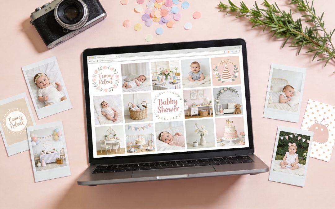
You’ve booked the brunch table, settled on a theme, and set up the registry. Then the visual work starts. That’s usually where a baby shower begins to drift off course.
I see the same problem often. The invite uses a soft watercolour bunny, the welcome sign switches to a bright cartoon design, the registry header gets cropped awkwardly on mobile, and the games are pulled from a different style again. None of those choices is disastrous on its own, but together they make the event feel less considered than it really is.
The fix is simple, but it does require a process. Set the mood first. Then choose licensed images from a source that fits your budget, print plans, and editing skills. After that, adapt the same visual direction across invitations, décor, games, social posts, and your registry page so everything feels like one event.
That workflow matters even more if guests are viewing details on their phones. A registry banner that looks polished and crops cleanly on mobile will hold up better across the full setup, especially if you’re using an online gift registry process that brings invitations and gift planning into one place.
The sources below are useful for different reasons. Some are better for polished commercial artwork. Some are better for editable templates. Some are fine for casual digital use but weaker for large-format print. I’ll cover the trade-offs, where each source works best, and how to use the images well on invites, signage, décor, and an online registry setup without creating licensing problems later.
1. Shutterstock
Shutterstock is the safest choice when you need polished baby shower images fast and you can’t afford to waste time digging through inconsistent results. It’s especially useful for invitations, printed signage, and registry banners where you want a clean, commercial finish instead of a casual social-media look.
The main advantage isn’t just volume. It’s control. You can filter by orientation, colour, style, contributor type, and image format, then keep building around one visual direction. For planners, that matters more than having endless options.
Where Shutterstock works best
If your shower theme is specific, like botanical, storybook, safari, lemon, teddy bear, or modern neutral, Shutterstock usually gives you enough matching assets to stay visually consistent across the whole event.
That’s hard to do on free sites. You might find one strong hero image elsewhere, but not a supporting set that covers:
Invitations: polished hero photos, illustrations, and background textures
Welcome signs: scenic art and soft-pattern backdrops
Registry headers: clean banners that crop well on desktop and mobile
Games and inserts: icon packs, borders, and editable vector art
Practical rule: If you’re printing anything larger than an A4 sign, inspect the asset type first. Vectors and high-resolution illustrations are usually more forgiving than a small JPG stretched too far.
Shutterstock is also straightforward about licence tiers. Standard works for most event collateral. Enhanced is the one to review if you’re using an asset in merchandise, resale products, or very broad distribution. For most private baby shower use, Standard is enough, but planners doing client work should check the intended use before downloading.
The trade-off
You pay for that convenience. Shutterstock can feel expensive if you only need one or two baby shower images and no design support. It’s better value when you’re building a full set of visual assets, not just grabbing a single photo.
I also recommend keeping a simple asset folder with downloaded licences and filenames, especially if multiple hosts are involved. If you’re creating a coordinated registry page alongside your invite suite, keeping your planning workflow tidy from the start helps. EasyRegistry’s how it works guide is a useful reference for how the page-sharing side fits into the broader event setup.
2. Adobe Stock
Adobe Stock is the best fit for hosts who already know they’ll be editing, resizing, layering text, or adapting the same artwork into multiple formats. If Shutterstock is the efficient stock library pick, Adobe Stock is the designer’s pick.
Its strength is the ecosystem. You don’t just get baby shower images. You get templates, vectors, backgrounds, and assets that move neatly into Photoshop, Illustrator, and InDesign. That’s a big advantage if you want the invite, welcome sign, favour tag, and registry hero image to feel like one set instead of four separate projects.
Why designers like it
Adobe Stock tends to be strong on curated aesthetics. The collections often feel more current and less “stocky”, especially for minimal, earthy, or editorial-style baby shower looks.
Editorial brunch showers: clean typography templates and lifestyle imagery
Playful illustrated events: vectors you can recolour without rebuilding the whole design
The licensing is clear. Standard licensing has defined copy thresholds, and extended licensing covers broader use such as resale or larger production contexts. If you’re making private event materials, it’s usually simple. If you’re a planner packaging editable templates for clients, you need to review the terms carefully.
One market nuance matters here. In Australia, baby shower hosts report 85% satisfaction with visual-centric registry tools that use high-fidelity gift previews, and that correlates with a 22% surge in home-focused gift purchases projected for 2026 in the HomePage News Occasions Report (HomePage News baby showers occasions report). That lines up with what Adobe Stock does well: polished, high-resolution visuals that help the whole event feel intentional.
The catch
Adobe Stock makes the most sense if you’ll use the workflow benefits. If you aren’t touching Creative Cloud and just want one image for a digital invite, it can be more platform than you need.
Good baby shower images don’t just look nice in search results. They need to survive cropping, text overlays, and print export without falling apart.
Prices can also look a bit awkward for Australian users because plans often default to USD before regional settings catch up. Still, if you care about visual consistency and expect to design more than one piece, Adobe Stock earns its place.
3. iStock by Getty Images
iStock is the practical middle ground for people who want stronger curation than many budget libraries but don’t necessarily need a full design suite. It’s especially useful when you want baby shower images that feel authentic rather than heavily staged.
Getty’s influence shows in the editing. Search results often feel cleaner and more intentional, and the Signature tier is where some of the best lifestyle imagery lives. If your shower style is less “cute graphics” and more “warm, modern celebration”, iStock is a strong option.
Essentials versus Signature
iStock becomes easier once you know what you’re buying. Essentials gives you broad, usable stock at a lower tier. Signature is the premium layer with more refined photography and stronger visual storytelling.
For baby shower planning, that usually breaks down like this:
Essentials: fine for simple invites, social posts, and lightweight signage
Signature: better for hero visuals, keepsake prints, and polished registry banners
Credit packs: useful if you only need a handful of assets
Subscriptions: better if you’re sourcing across multiple events
The licence structure is also relatively easy to work with once you read it closely. Standard covers most event marketing and personal project use. Extended matters if your use goes beyond that, particularly for high-volume printed distribution or products for resale.
One area where iStock deserves credit is inclusivity. The stock market still has obvious gaps in baby shower imagery. In Australia, ABS data released in March 2025 notes that 6.2% of births in 2024 were to same-sex couples, 5.1% involved gender diverse parents, and 30% were to overseas-born mothers, yet current stock searches still lean heavily toward narrow, gendered imagery (Adobe Stock neutral baby shower search reference). iStock isn’t perfect here, but it often gives better results than smaller libraries when you search beyond pink-and-blue clichés.
What to watch
iStock’s buying model can confuse first-time users. Credits, tiers, and licence upsells aren’t hard once you’ve done it once, but they aren’t as frictionless as Canva or Pexels.
If you’re planning a shower with a strong visual identity and want photos that feel like real people, real homes, and actual gatherings, iStock usually performs well. If you need editable decorative elements more than photography, Freepik or Canva may be the better tool.
4. Canva
The invitation needs to go out tonight. The sign for the dessert table still is not done. The registry page looks unrelated to both. Canva solves that specific baby shower problem better than many stock libraries because it combines image sourcing, editing, resizing, and export in one workflow.
That matters if you are building a theme, not just collecting pretty pictures. A shower usually needs one visual direction carried across the invite, welcome sign, game cards, social posts, and registry header. Canva makes it easy to choose a style first, then apply it everywhere without exporting files back and forth between tools.
Where Canva works best
Canva is strongest for hosts who need finished pieces quickly and want reasonable control over the final look. It is especially useful for:
Invitations: edit text, colours, sizing, and layout in minutes
Digital sharing: story graphics, email headers, and mobile-friendly event posts
Day-of stationery: signs, menus, advice cards, favour tags, and game sheets
I use Canva most often after the theme is already clear. Neutral florals, teddy bear, lemon, safari, bow, moon-and-stars. Once that decision is made, Canva helps keep every item visually consistent. That consistency usually matters more than having the most exclusive image in the room.
The trade-off is asset quality control. Canva gives you speed, but it does not curate for you. Search results can mix polished photography, flat illustrations, clip-art style graphics, and trendy templates that date quickly. The fix is simple. Pick one visual lane and stick to it. One photo style. One illustration style. Two fonts at most. A tight colour palette.
What to watch before you download
Canva’s licensing is practical for standard event use, but it is not a blank cheque. Using an image inside an invitation, sign, or registry graphic is generally fine. Pulling Canva elements into products you plan to sell, or repackaging artwork as your own printable set, needs much closer review of the licence terms.
It also helps to test your design in the format guests will see. A layout that looks balanced on an A4 print can feel cramped on a phone screen. For baby showers, mobile readability usually wins. Keep text short, use high contrast, and avoid delicate script fonts for key details like date, time, and address.
Use Canva if you want the shortest path from concept to finished baby shower visuals, especially when the same theme needs to appear across invites, decor, and your registry page. Choose another source if your priority is premium standalone photography or a large library of specialised licensed images.
5. Freepik
A common planning problem starts like this. The invite looks lovely, then you try to build matching game cards, welcome signs, favour tags, and a registry header, and nothing feels like it belongs to the same shower. Freepik solves that better than most photo libraries because it is built for themed asset sets, not just one strong image.
It is the strongest option in this list for illustration-led baby shower styling. If your concept depends on teddy bears, bows, woodland animals, moons, florals, rainbows, clouds, or soft pattern backgrounds, Freepik usually gives you enough related pieces to build a full visual system. That matters when the goal is not only to find artwork, but to carry one theme across invites, decor, and a personalised EasyRegistry page.
Where Freepik is most useful
Freepik is at its best when you need assets that can be edited, recoloured, resized, and reused across multiple formats. That makes it practical for hosts who already know their theme and need the pieces to support it.
It works well for:
Full decor suites: matching illustrations, frames, borders, and background patterns
Print-first projects: vectors and PSDs for invitations, signs, advice cards, and games
Theme-heavy showers: styles that need repeated motifs, not just one banner image
Colour matching: adapting artwork to fit flowers, tableware, balloon palettes, or nursery colours
The big trade-off is curation time.
Freepik has excellent contributors, but the library also includes dated styles, overly busy compositions, and assets that look cheap once printed. The safest approach is to choose one pack or one contributor style first, then build outward from there. Mixing three different illustration styles usually creates the same inconsistency you were trying to avoid.
Best uses for event planning
I use Freepik earlier in the workflow than many hosts expect. It is useful for setting the theme, not only decorating after the theme is chosen. One illustration pack can tell you the colour palette, font direction, and tone of the whole event, whether that is soft and classic, playful and bright, or modern and minimal.
It is also practical across formats. A vector that works on an invite can usually be adapted for a welcome sign, cupcake topper, thank-you tag, or digital banner with less rework than a photo-based design. That flexibility is where Freepik earns its place on this list.
Licence discipline matters here
Freepik is cost-effective, but only if you check the usage terms before building half your event around one asset pack. Attribution rules can vary. So can what your plan allows. Restrictions around reselling or distributing assets in near-original form matter if you are creating editable printables or sharing files beyond personal event use.
If the shower needs a tightly matched visual kit, Freepik is one of the first places to check. If the priority is a single premium lifestyle photo with a natural editorial feel, another source will usually be a better fit.
6. Unsplash
Unsplash is the best source in this list for natural-looking photography that doesn’t immediately scream stock library. If your baby shower mood is intimate, calm, homey, and modern, Unsplash often gives you the right emotional tone.
I’d look for soft brunch-table scenes, flowers on linen, parent-to-be lifestyle shots, nursery details, flat lays, and other imagery that works well for mood boards, blog posts, and registry headers. The platform is less useful for tightly coordinated event systems and more useful for establishing atmosphere.
Why Unsplash works
The free library is broad, and the photography often feels editorial rather than overtly commercial. That can make a registry page or digital invite feel more personal, even when the image isn’t custom.
Unsplash is strongest for:
Hero banners: one standout image at the top of a registry or event page
Mood boards: collecting a visual direction before choosing colours and fonts
Content-led pages: blog posts, event guides, and email headers
Minimalist digital invites: especially when text does most of the work
Unsplash+ adds premium content and stronger legal protections, which may matter if you’re using the images in more formal promotional contexts. For a private shower, many hosts will stay within the core library, but it’s still worth checking releases and usage limits if recognisable people or branded items appear.
One practical caution. Free isn’t the same as risk-free. You still need to pay attention to whether an image includes identifiable faces, logos, private property, or details that create unintended associations.
A lovely photo can still be the wrong photo if it fights your text or crops badly on mobile.
Where it falls short
Unsplash usually won’t give you a whole matching baby shower package. You may find the perfect banner image, then struggle to locate supporting assets in the same visual language.
That’s why I use Unsplash as a mood setter, not as the only source. It’s excellent for a hero image on an invite or registry page. It’s less reliable when you also need matching game cards, illustrated signage, and decorative iconography.
7. Pexels
A host has picked a theme, the invite needs to go out tonight, and there is no room in the budget for a paid stock subscription. Pexels is one of the first places I check.
It works best when the goal is speed and flexibility, not a tightly matched design suite. You can usually find fresh lifestyle photos, nursery details, flat lays, soft colour palettes, and vertical images that fit mobile screens without much editing. The free video library also helps if the shower includes a digital invite, a reel, or a simple slideshow for a virtual event.
Where Pexels earns its place is in the middle of the workflow. Use it after you have chosen the mood, but before you commit to final layouts. It is a practical source for:
Screen-first invites and event reminders
Pinterest mood boards tied to a colour palette
Registry headers and supporting gallery images
Virtual shower slides, stories, and short video clips
Blog or planning content for the event page
The trade-off is consistency. Paid libraries usually make it easier to build a full matching set for print, signage, and inserts. Pexels is better for finding a few strong pieces that support the theme you already chose. For example, I might use one warm neutral image for the invite, then a close-up detail shot for the registry banner, then keep the rest of the design simple so the visuals still feel intentional.
If you are testing how images will look on a live registry before finalising the design, EasyRegistry’s sample baby registry pages are useful for checking crop styles, text placement, and how a photo reads on mobile.
Use care with licensing even on free platforms. Check for recognisable faces, visible brands, private property, or anything that could create the wrong association for the event. Pexels is easy to use and often good enough for digital baby shower materials. It just asks for a more careful eye when you want the final result to look polished.
Baby Shower Images, Top 7 Sources Compared
Service
Implementation complexity ?
Resource requirements ?
Expected outcomes ?
Ideal use cases ?
Key advantages ?
Shutterstock
Moderate, choose Standard vs Enhanced; straightforward UI
Paid (subscription or per image); higher cost for extended/merch
Free high-quality images; Unsplash+ adds protections and exclusives
Pexels
Very low, simple download and license; verify releases when needed
Free to use; no subscription required
Good quality for social and blog use; less depth than paid libraries
Zero-cost projects, social media, lightweight marketing
Simple, human?readable license and free access to photos/videos
From Mood Board to Memory Using Your Images
You’ve picked a theme, chosen a few strong visuals, and sent the invite. The next job is making those same baby shower images carry through the full guest experience. That continuity is what makes a shower feel planned, not patched together at the last minute.
Start with one visual direction, then apply it across every touchpoint that guests see. In practice, that usually means one hero image, one supporting texture or background, and one graphic style for signs, games, and digital pieces. A neutral shower works well with soft photography and restrained line art. A teddy, bow, or storybook theme usually looks better with illustrated assets doing most of the work.
The trade-off is simple. More variety gives you more options, but less consistency. For most baby showers, consistency wins.
Practical next steps
Resize for the format: A registry banner, printed invite, welcome sign, and Instagram Story all need different dimensions. Crop each file for its final use instead of stretching one image across everything.
Check print quality early: Images that look sharp on a phone can print softly or pixelated on signage. For anything going on a foam board, poster, or large card, test the resolution before you approve the design.
Write useful alt text: Describe the image clearly. “Boho baby shower flat lay with dried florals, beige invitation, and wooden rattle” gives more context than “baby shower image”.
Match the registry to the event: Use the same hero image, colours, or illustration style from your invite on your registry page so guests know they’re in the right place.
Keep a tight kit of assets: Save one folder with approved photos, graphics, fonts, and colour codes. That avoids the common problem of mixing soft editorial photos with clip art that feels unrelated.
This matters even more for mobile viewing. Guests will open invites, registry pages, and event updates on phones first, and many baby showers now include at least some digital planning touchpoints or remote participation. Images need to crop cleanly, load quickly, and still look intentional on small screens.
If you want to personalise gifts and presentation as carefully as the event branding, this list of best baby shower gift ideas is a useful companion read.
For hosts using a registry alongside invites and decor, EasyRegistry gives you one place to organise gifts, share a single link with guests, and present the page in a style that matches the rest of your baby shower planning.
Used well, baby shower images do more than fill space. They set the tone early, make your registry feel intentional, and help the event look like one complete story from the first mood board to the final thank-you.
You’re probably here because breastfeeding is going well enough that you want a little flexibility, but not so well that you feel relaxed about changing anything. You might want your partner to do one evening feed. You might be planning for childcare or a return to work. Or you may want the option of leaving the house without watching the clock.
That’s the moment when bottle shopping gets oddly stressful.
Parents often tell me the same two worries sit side by side. They want a bottle that works, and they’re scared that the wrong one will lead to fussing at the breast, flow preference, shallow latch, or a baby who suddenly decides milk should always arrive faster and with less effort. Those concerns are valid. They also don’t mean you need the “perfect” bottle. You need a bottle that suits a breastfed baby’s latch, pace, and feeding pattern.
The best bottles for breastfed babies aren’t always the ones with the loudest packaging claims. In practice, what matters most is nipple shape, flow, venting, bottle size, cleanability, and how that bottle fits into your actual life in Australia. That last part gets skipped in many roundups. A bottle might look ideal online and still be annoying if it doesn’t work with your pump, is hard to replace locally, or requires fiddly parts at 2 am.
Navigating Your Bottle Feeding Journey
A common scenario looks like this. Baby is a few weeks old, breastfeeding is finally feeling less chaotic, and someone suggests introducing a bottle “just so they’ll take one.” Suddenly a simple purchase feels high stakes. Parents start comparing teats, anti-colic systems, and bottle shapes, then get overwhelmed because every brand claims to mimic the breast.
That confusion makes sense. Marketing tends to flatten a nuanced decision into a single promise. Real feeding doesn’t work that way.
One family may need a bottle that slows down a keen feeder who gulps and splutters. Another may need a shape that encourages a wider latch. Another may need something straightforward to pair with regular pumping. The right choice depends on the problem you’re trying to solve.
If you’re still learning your baby’s rhythm, it helps to look at feeding patterns first rather than shopping by hype. A simple guide to newborn feeding schedules and hunger cues can help you tell the difference between a baby who’s ready to feed, a baby who’s overtired, and a baby who’s already upset enough to reject anything unfamiliar.
Parents often blame the bottle when the real issue is timing. A calm, alert baby is much more likely to accept a new teat than a hungry, frustrated one.
The other point I reassure parents about is this. Bottle introduction is rarely a one-feed verdict. Some babies accept the first bottle with no fuss. Others need a few low-pressure attempts before it clicks. That doesn’t mean breastfeeding is doomed, and it doesn’t mean you chose badly. It usually means you’re still matching the bottle to your baby’s latch and temperament.
The Anatomy of a Breastfed Baby Friendly Bottle
A bottle can look beautifully designed and still be a poor match for a breastfed baby. What matters is how the teat behaves in the baby’s mouth, how quickly milk flows, and whether the bottle fits your day-to-day routine.
Feature
What to look for
Why it matters
Nipple shape
Gradual slope, rounded form
Encourages a wider, deeper latch
Flow rate
Slow flow
Helps bottle feeding feel closer to breastfeeding pace
Bottle size
Smaller newborn size
Makes portions easier to judge
Venting
Effective but practical system
May reduce swallowed air
Cleaning
Parts you can manage daily
A “good” bottle that’s painful to clean often gets abandoned
Nipple shape matters more than branding
The teat shape does much of the work. A gradual slope usually supports a wider mouth opening, which is closer to how babies feed at the breast. Teats with a sudden, narrow tip-to-base change can encourage a shallow latch, and that often leads to clicking, slipping, or gulping.
Parents in clinic often focus on whether a bottle is marketed as “breast-like.” I pay more attention to whether the baby can maintain a deep, comfortable latch without losing suction. That tells you more than the packaging does.
A smaller bottle size is often the most practical place to start for younger babies, especially if you are offering expressed breast milk and keeping feeds modest. For Australian parents, this also keeps things simpler if you are pumping with Medela or Spectra and transferring milk into storage bottles before feeding. Fewer oversized bottles end up sitting half-used in the cupboard.
Practical rule: If the teat encourages a narrow, pursed suck, it is less likely to support smooth switching between breast and bottle.
Slow flow usually protects breastfeeding better
A breastfed baby generally does best with a teat that asks them to work for milk. Slow flow helps them suck, pause, breathe, and swallow in a more organised pattern. That rhythm matters.
If milk comes too quickly, babies can start spluttering, leaking milk from the sides of the mouth, or finishing feeds before satiety cues catch up. Some then begin to prefer the bottle because it is easier and faster. Often, the issue is timing, not the bottle itself, but an overly fast teat can make that problem worse.
Labels are not reliable enough on their own. One brand’s slow flow can behave like another brand’s medium. Watch your baby. If feeds look rushed, noisy, or messy, the flow may be too fast even if the box says otherwise.
Material changes the daily workload
Material does not usually determine whether a baby accepts the bottle, but it absolutely affects convenience, sterilising, and how the bottle holds up over time.
Polypropylene plastic is light, easy to find in Australia, and usually the least expensive starting point.
PPSU suits families who sterilise frequently and want a tougher plastic that holds up well.
Glass or glass-lined hybrid bottles are popular with parents who want easier stain resistance and a cleaner feel, but they are heavier.
Silicone feels soft and flexible, which some parents like, though not every baby feeds well with a very compressible bottle.
There is no perfect material. The best one is the one you will still be happy washing at 2 am.
Venting helps some babies, but every extra part has a cost
Venting systems can reduce swallowed air for babies who gulp, click, or seem uncomfortable after feeds. They can be very helpful in the right situation. They also create more washing up.
That trade-off matters more than many buying guides admit. A bottle with multiple inserts, valves, or fiddly vents may work beautifully for one baby and still be unrealistic for a family doing six or eight feeds a day. If you are expressing regularly, this becomes even more relevant. Australian parents using Medela or Spectra pumps often do best with a setup that keeps pumping, milk transfer, and bottle prep straightforward rather than adding another complicated system to wash.
A bottle that reduces air intake but leaves you scrubbing tiny inserts every night may still be the wrong bottle for your household.
Ease of cleaning affects whether you will keep using it
Consistency helps babies learn a bottle. Consistency is much easier when the adults do not dread the cleanup.
Wide neck bottles are often easier to wash thoroughly by hand. Narrow bottles can still work well, but they are less forgiving if milk collects around threads, bases, or vent pieces. Drying time matters too. Parts that stay damp for hours become annoying very quickly.
This is also where local availability matters for Australian families. A bottle may test well overseas and still be a poor practical choice if replacement teats are hard to find at Chemist Warehouse, Baby Bunting, your local pharmacy, or online from Australian retailers. If you need a different flow rate next week, access matters just as much as design.
A Framework for Comparing Top Bottle Contenders
A useful bottle comparison starts with the feeding problem you are trying to solve. A baby who clicks, gulps, or spills milk needs a different bottle from a baby who refuses the teat. Parents who pump several times a day often need something else again. The best choice is usually the bottle that supports feeding well enough without creating extra work you will resent by day three.
If you are building a shortlist for your registry, keep it small. Two or three well-chosen options are usually more useful than a full matching set. You can see how other Australian families keep bottle choices flexible in these sample baby registry setups.
Quick comparison at a glance
Bottle
Best fit
Main strength
Main trade-off
Dr. Brown’s Options+ narrow bottle
Babies with gas or frequent spit-up concerns
Strong venting system and narrow sloped design
More parts to clean
Pigeon PPSU Wide Neck
Babies needing an easier latch transition
Gradual taper that encourages a wider latch
Availability can vary
Chicco Duo Hybrid
Parents wanting a durable hybrid material
Glass-lined construction with plastic outer
Nipple shape may not suit every early breastfed baby
NUK Perfect Match Slow Flow
Newborns needing controlled flow
Slow-flow design and compression-style feeding feel
Some babies still need trial and adjustment
Gulicola and Lansinoh bottles
Families prioritising gentle flow and anti-colic features
Slow-flow design and venting focus
Brand access may differ by retailer
For a natural latch
If preserving a deep latch at the breast is your main goal, teat shape deserves close attention.
The Pigeon PPSU Wide Neck is often a sensible starting point because the teat has a gradual taper rather than a short, abrupt tip. That shape tends to suit babies who already open widely at the breast and struggle with flatter or more protruding teats. In practice, it is often a better match for transition feeds than bulky teats marketed as “breast-like.”
I still would not call it universal. Some breastfed babies do better with a narrower teat than their parents expect, especially if they are organised feeders who latch efficiently and dislike a large teat in the mouth. The box only tells you so much. The baby makes the final decision.
This type of bottle is usually worth trying if:
Your baby already takes a deep latch at the breast
You are offering occasional bottles and want to protect that latch pattern
You have noticed chewing, slipping, or shallow sucking on other teats
For reducing colic and swallowed air
Babies who gulp hard, come off coughing, or seem uncomfortable after feeds often need a bottle with better venting. That does not mean every unsettled baby needs the most engineered system on the shelf. It means air management should move higher up your priority list.
The Dr. Brown’s Options+ narrow bottle is a common choice for this reason. Its vented system is designed to reduce air intake during feeds, and the narrower sloped teat can suit babies who do not manage wide-neck teats well. The trade-off is straightforward. More parts mean more washing, more drying, and more chances to misplace something at 2 am.
The NUK Perfect Match Slow Flow can also work well here, especially for babies who cope better with a slower, more controlled suck pattern. It usually appeals to parents who want some air-control support without committing to the fiddliest bottle setup in the cupboard.
A bottle only helps if you can use it consistently. If a vent system feels too annoying to clean and reassemble, it stops being the right choice for your household.
For durability and heavy rotation
Some bottles hold up better than others under repeated sterilising, transport, and daily use. That matters more than branding if you are expressing often, sending bottles to childcare, or washing the same few bottles on repeat.
The Chicco Duo Hybrid stands out because it combines a glass inner surface with a plastic outer shell. For parents who like the idea of milk sitting against glass but do not want the weight and breakability of a traditional glass bottle, that is a practical middle ground. It often feels reassuring in the hand and copes well with frequent cleaning.
The caution here is simple. A durable bottle is not automatically the easiest bottle for a breastfed baby to accept. If latch transfer is your main concern, teat shape still matters more than bottle body material.
This option often suits families who:
Pump regularly and reuse bottles heavily
Want a bottle that feels sturdy without being fully glass
Care about long-term wear as much as initial feeding performance
For a very slow pace
Some babies are not especially windy or fussy about shape. They just need the flow to slow down.
The NUK Perfect Match Slow Flow fits that brief well, particularly in the newborn stage when a faster teat can turn a calm feed into a messy one. A slower feed gives the baby more control and makes paced bottle feeding easier for the adult.
Gulicola and Lansinoh can also be worth considering if your current bottle seems too fast. Both are commonly chosen for gentler flow and anti-colic features. Availability and teat stock can vary, so they make more sense as a targeted trial than a bulk buy.
What usually works, and what tends to backfire
Across brands, a few patterns come up again and again in real feeding plans.
What usually helps:
A gradual teat slope that supports a deeper latch
A slow flow in the early months
Bottle sizes that match the baby’s age and feed volume
A venting system that solves a clear problem
Testing one bottle before buying multiples
What often causes trouble:
Choosing the bottle with the most convincing packaging
Buying a large starter set before any trial feed
Assuming wide-neck automatically means breastfed-baby friendly
Moving to a faster teat because the feed feels slow to the adult
Changing bottle type every day and expecting the baby to settle quickly
If parents ask me where to start, I usually suggest this order. Pick one bottle for latch, one for air management if that is an issue, and only then compare extras like materials or aesthetics. That approach saves money, reduces clutter, and gives you clearer answers faster.
Practical Considerations for Australian Parents
Many international bottle guides fall short by comparing brands as if every family shops from the same shelves and uses the same pump systems. Australian parents know that’s not how it works.
Some brands are easy to replace locally. Others appear in reviews constantly but are awkward to source, inconsistent in stock, or expensive once you start chasing extra teats and replacement parts. That matters more than people admit. Bottle feeding gets frustrating fast if you can’t reliably buy the teat your baby finally accepts.
Pump compatibility matters more than most reviews admit
For Australian families, pump compatibility deserves a place near the top of the checklist. Verified data notes that 68% of Australian breastfeeding mothers use electric pumps, and that many reviews still don’t test compatibility with dominant local pump brands such as Medela or Spectra. The same summary says a 2025 CHOICE Australia test found only 3 of 15 bottles scored over 80% for slow-flow consistency when used with Medela flanges, as reported in The Bump’s bottle roundup summary.
That means a bottle can be excellent on paper and still annoy you in daily use if it doesn’t pair neatly with your expression setup.
Here’s the practical consideration:
Direct-fit convenience: If a bottle attaches directly to your pump system, you reduce transfers, spills, and washing.
Adaptor dependence: Some combinations work, but only with adaptors. That’s manageable if you’re organised, but irritating if you’re expressing several times a day.
Flow after pumping: A bottle that fits the pump but has a faster-than-expected teat may still undermine your mixed feeding plan.
If you’re building a shortlist before baby arrives, it can help to save likely options in one place so you can compare bottles, pumps, and accessories side by side. A sample of how parents organise those choices is available through EasyRegistry sample registries.
Availability and replacement parts
A bottle is only as useful as your ability to replace the teat your baby likes. Before committing, check whether the brand is easy to find through major Australian baby retailers, pharmacies, or reliable online sellers.
I usually suggest parents ask three questions before buying a full set:
Can I buy replacement teats locally without much hassle?
If this bottle works, can I get the same teat in the next stage when needed?
If I lose a vent or cap, can I replace that part without replacing the whole system?
Those questions sound mundane. They save a lot of grief.
Buy for your routine, not an idealised one
A family who mostly breastfeeds and gives one occasional bottle may tolerate a more complicated anti-colic design. A family who pumps daily often needs a bottle that’s efficient, easy to wash, and easy to pair with storage and expression routines.
That’s the Australian reality many generic guides miss. The best bottles for breastfed babies aren’t just about latch theory. They also need to fit your pump, your shops, and your week.
Introducing the Bottle and Troubleshooting Rejection
The first bottle feed usually goes best when nobody treats it like a test. If the adults are tense, the baby often is too.
The first bottle feed
Start when your baby is calm, awake, and interested in feeding, but not desperate. A baby who is already very hungry is more likely to get upset by any change in flow, smell, or holding position.
If possible, let someone other than the breastfeeding parent offer the first few bottles. Many babies can smell milk and protest because they know the breast is nearby. A different caregiver removes that negotiation.
Keep the baby semi-upright. Hold the bottle fairly level, not tipped vertically so milk rushes into the teat. Let the baby draw the teat in rather than pushing it in quickly. Pause during the feed. Switch sides halfway through if that helps keep the experience balanced and paced.
Feeding cue: Bottle feeding works best when the pace stays with the baby, not the adult.
If baby chews the teat
Chewing usually means the baby hasn’t figured out how to latch onto that teat shape, or the flow isn’t matching what they expect.
Try these adjustments:
Touch the teat to the lips first and wait for a wider mouth opening.
Check the shape. Some babies do better with a more gradual slope.
Warm the teat slightly under warm water so it feels less starkly different from the breast.
Slow the environment down. A baby who’s overstimulated often fusses with the teat instead of organising a good suck.
If baby drinks, then fusses halfway through
This often points to pace, air intake, or frustration with the flow.
A few things to try:
Pause more often and give brief burp breaks.
Keep the bottle more horizontal so milk doesn’t pour too fast.
Check the venting system and make sure it’s assembled correctly.
Watch swallowing. If the baby is gulping, coughing, or leaking milk, the teat may be too fast.
This demonstration can help if you want to see paced technique in action:
If baby refuses outright
Refusal feels personal. It usually isn’t.
Some babies need a different context before they’ll accept a bottle. Try offering it at a different time of day, in a different room, or while walking gently rather than sitting in the usual breastfeeding spot. Some babies take a bottle more easily when they’re a little sleepy. Others prefer being fully alert.
You can also experiment with temperature. Some babies accept expressed milk more readily when it’s closer to body temperature. Others care less about the milk and more about the teat texture or shape.
If refusal continues, don’t keep forcing the issue in a prolonged battle. Stop, reset, and try again later. Repeated pressure can make the bottle itself feel unpleasant.
If the bottle works but breastfeeding changes
This is the moment to slow down and look at feeding technique before blaming the concept of bottles altogether. Keep bottle feeds paced. Use the slowest workable teat. Avoid letting feeds become very fast and easy compared with the breast.
If you notice breast fussing, shallow latch, or sudden impatience at the breast, the bottle may be flowing more quickly than you realised. Often, a small adjustment in teat choice or feeding pace solves the problem.
Building Your Baby Registry with EasyRegistry
Registry planning is where bottle advice often gets expensive. Parents read one glowing review, add a full boxed set, and end up with six bottles their baby doesn’t like. That’s not a feeding problem. It’s a shopping strategy problem.
The smartest registry plan for bottles is simple. Add a small test selection, not a bulk commitment.
What to put on your registry first
If you’re expecting to combine breastfeeding with pumped milk, shortlist two or three bottle styles that solve different problems. For example, one may be your latch-friendly option, one your anti-colic option, and one your easy-clean option.
Then add:
One or two single bottles of each candidate rather than one large multi-pack
Extra slow-flow teats for the bottle that ends up working best
A bottle brush that matches the shape and size of your chosen bottle
A drying rack that can handle small parts without losing them
A sterilising solution that suits your kitchen and routine
This approach keeps your gifts useful and reduces waste.
Add the supporting items that make bottle feeding easier
Parents often focus so hard on the bottle that they forget the accessories that make the whole system manageable. If you’re expressing, think in systems. How will milk be pumped, stored, warmed, fed, and cleaned up afterward?
You may also want a few comfort-focused postpartum and baby care items on the same list. If you’re curating a more thoughtful care section, this guide to luxury baby and maternal skincare products can help you choose items that feel practical and giftable rather than decorative.
Build for testing, then scale up
Once your baby clearly prefers one bottle, then it makes sense to build out the rest of that system. Until then, flexibility is worth more than quantity.
For parents creating a dedicated list before the baby shower, the easiest place to organise bottles, feeding accessories, and the rest of your newborn essentials is an EasyRegistry baby shower registry. The key is keeping the registry adaptable so you can change course once your baby shows a preference.
Don’t register for a warehouse of one bottle style. Register for a smart trial run.
Frequently Asked Questions About Bottle Feeding
How should I clean and sterilise baby bottles?
Wash bottles and teats promptly after feeds so milk residue doesn’t sit in seams or vents. Use hot soapy water and a brush that reaches the inside corners and teat base properly. If your bottle has valves or inserts, take them apart fully each time according to the manufacturer’s instructions.
Sterilising matters most when equipment is new and in the early feeding period, or any time your clinician has advised extra caution. The safest routine is the one you’ll do thoroughly and consistently.
What’s the safest way to warm expressed breast milk for a bottle?
Warm the milk gently rather than overheating it. A bowl or jug of warm water works well, as does a bottle warmer used carefully according to instructions. Swirl the bottle to distribute warmth evenly.
Avoid guessing based on the bottle’s outer feel alone. Test a small drop on the inside of your wrist. It should feel lukewarm, not hot.
When should I move up to a faster flow teat?
Move up only if your baby is consistently showing that the current teat is too slow, not because of age alone. Signs can include prolonged frustration during bottle feeds despite good latch, strong sucking with very little transfer, or repeatedly collapsing the teat while remaining hungry.
Don’t size up just because someone says your baby “should” be ready. Many breastfed babies do well on a slow flow for quite a while.
What if my baby never takes a bottle well?
Some babies never love bottles, and that doesn’t mean you’ve failed. It may mean the teat shape isn’t right, the timing hasn’t been ideal, or your baby strongly prefers other feeding methods. If bottle feeding is essential and repeated attempts are stressful, personalised help from a lactation consultant or feeding professional is worth getting.
If you’re also sorting out shower gifts and feeding gear questions at the same time, the EasyRegistry FAQ page is useful for the registry side of planning.
If you’re preparing for a baby shower or setting up a practical gift list, EasyRegistry makes it easy to organise bottles, feeding accessories, and newborn essentials in one place. It’s a simple way to avoid duplicates, keep your shortlist flexible, and build a registry around what your family will use.
You’re probably in the middle of that very specific kind of baby prep spiral. One tab has prams open. Another has swaddles. Someone has told you that you “absolutely need” a wipe warmer, while someone else swears you need almost nothing. Meanwhile, people are already asking what to buy for the baby shower.
That’s usually the point where a registry stops feeling like an optional extra and starts feeling like the easiest way to stay organised. If you’re looking for a baby shower registry australia guide that feels practical, local, and a bit less overwhelming, this is the version I’d hand to a friend.
Why a Baby Registry Makes Sense in Australia
A lot of Australian parents still feel slightly awkward about registries at first. There’s often a moment of, “Is this a bit too American?” Then the messages start coming in from family, friends, workmates, cousins interstate, and people who want to help but have no idea what you need.
That’s where a registry earns its keep.
Why more Australian parents are using one
Baby registries have become much more common here, especially for first-time parents, and they help manage the AUD 10,000+ cost of a baby’s first year by steering gifts toward practical, wanted items instead of duplicates, as noted in Healthy Mum & Bub’s guide to baby registries in Australia.
That shift makes sense in real life. Australian baby showers often pull together different circles at once. Your uni friends, your mum’s friends, your partner’s family, work colleagues, and relatives in another state may all want to buy something. Without a list, you can end up with lovely gifts that just don’t match what you need.
A registry isn’t a demand list. It’s a translation tool for generous people.
What works better than a vague wish list
A simple message like “we’d love anything practical” sounds polite, but it creates guesswork. Guesswork usually leads to too many tiny outfits, duplicated toys, or gifts that don’t suit your home, budget, or stage of life.
A proper registry gives people options without pressure. It also helps with a very Australian mix of gift styles:
Physical gifts like cot sheets, nappies, bath items, feeding gear, books, and clothes
Group gifts when family or friends want to chip in for a pram or nursery item
Cash-style contributions for bigger goals that don’t fit neatly into one boxed present
Why local context matters
Australian families often need to think about local shipping, regional delivery, home size, and climate. A registry that lets you keep everything in one place is easier for guests and far easier for you.
If the aim is less stress, fewer double-ups, and more useful support, a registry is one of the most sensible things you can set up.
Your First Steps with EasyRegistry
You don’t need to build the whole registry in one sitting. The easiest start is to get the page created first, then add items gradually as your thinking gets clearer.
Start with the page, not the products
Create your registry and give it a simple name. Something like “Baby Smith Shower” or “Welcome Baby Jones” is enough. You can always make it prettier later.
Don’t begin with the fun extras. Start with the things that affect the rest of your list.
A good first pass usually includes:
Sleep basics like fitted sheets, swaddles, sleeping bags, or a bassinet item you’ve already chosen
Feeding essentials whether you’re planning to breastfeed, bottle feed, or want flexibility
Out-and-about gear such as a pram accessory, baby carrier, or nappy bag
Bath and care items that people like gifting because they’re useful and easy to buy
A fund option for something larger or less gift-wrapped, like nursery setup or future purchases
Keep the dashboard simple
The most useful registry pages are easy to scan. Guests shouldn’t have to work hard to understand what you’re asking for.
Use short item names. Add a note if colour, size, or style matters. If it doesn’t matter, say so. That one detail saves a lot of back-and-forth.
Here’s a simple approach that keeps the list clear:
Registry element
Better choice
Less helpful choice
Item title
White fitted cot sheets
Bedding
Item note
Any neutral colour is fine
Must be exactly like photo
Fund name
Nursery fund
Miscellaneous
Category
Feeding
Baby stuff
Practical rule: If a guest can understand the item in a few seconds, you’ve written it well.
Don’t try to be finished immediately
Most parents edit the list several times. That’s normal. Start with the broad shape of what you need, then refine it as you learn what suits your home and routine.
The best first step is getting the page live and usable.
How to Curate the Perfect Mix of Gifts
A strong registry isn’t the longest one. It’s the one that reflects how you’ll live once the baby is here.
That matters because new mothers typically use only 8 to 12 items daily, and the average registry cost often sits around $3,000 to $5,000, according to BubbaCloud’s registry reflection. That’s why a shorter, more focused list usually serves you better than a giant catalogue of “just in case” products.
Focus on the things you’ll reach for constantly
Think about the first tired weeks at home. You won’t be pulling out novelty gear. You’ll be reaching for the same practical items again and again.
That usually means your registry should lean toward:
Daily-use basics such as swaddles, burp cloths, bottles, nappies, wipes storage, fitted sheets, and simple babywear
One or two major items that people may want to contribute toward together
Post-birth support like meal help, pharmacy runs, or flexible funds
A few sentimental picks because guests do enjoy buying something sweet, not only the purely functional things
The most useful mix
A balanced list gives people genuine choice. Some guests want to buy a tangible present. Others would rather chip in toward something bigger. Some need a lower-price option and feel uncomfortable if every item looks expensive.
Here’s the mix I’d recommend in practice:
Everyday essentials
These make the best backbone of your list. They get used, they’re easy to buy, and they don’t create clutter for the sake of clutter.
Think in terms of repetition. If you’ll wash it often, use it daily, or replace it regularly, it belongs near the top.
Bigger nursery or travel items
These are worth listing, but be selective. One pram-related item, one sleep-related item, or one nursery item is usually enough. Too many large-ticket products can make the registry feel hard to browse.
If several people want to contribute, group gifting or a fund-style option is often cleaner than asking one guest to buy one big item outright.
Cash funds and flexible contributions
Many Australian parents feel relieved. Not everything you need comes in a tidy gift box. Sometimes what helps most is money toward a nursery setup, a post-birth meal fund, or future essentials once you know what your baby likes.
That’s one reason some parents use a platform such as EasyRegistry. It allows a registry to include both physical gifts and cash funds on the same page, which is useful when your guest list includes people who prefer traditional presents and others who want to contribute more flexibly.
What usually doesn’t work
Some lists become stressful because they’re built around what looks cute online, not what fits your life.
Watch for these traps:
Too many niche gadgets that solve problems you may never have
Overcommitting on newborn sizes when babies move through them quickly
Adding items before choosing your routine especially for feeding or sleep
Ignoring your space if you live in a unit, share rooms, or don’t have much storage
If an item only makes sense in a perfectly tidy nursery photo, question it.
Keep the budget realistic
You don’t need to add everything at full price. If you’re comparing products, it can help to check coupons for baby and kids items so you can save certain purchases for later and keep the registry centred on things guests are most likely to cover.
If you want examples of how other parents structure their lists, the EasyRegistry sample registries can help you judge balance, wording, and price variety without starting from scratch.
The best registry feels calm. It says, “These are the things that will genuinely help us,” not, “We panic-added half the internet.”
Personalising and Sharing Your Registry
Once the list is useful, make it feel human. Guests respond better to a registry when it sounds like it came from you, not from a template.
Make the page warm, not formal
You don’t need a polished brand voice. A short welcome note is enough.
Include:
A simple thank you for celebrating with you
A note about flexibility so guests know there’s no pressure
A line about preferences if you’re open to second-hand books, practical items, or contributions toward funds
A photo if you want the page to feel more personal
Good wording is usually soft and straightforward. Something like, “We’re so grateful you’re celebrating with us. We’ve put together a list of items and contribution options that would be a real help as we prepare for baby.”
How to share it without sounding awkward
Many parents often get stuck on this point. The trick is to make the registry available, not to make it the whole message.
A few sensible options:
Include it with the invitation
If someone else is hosting, the host can add a gentle line such as:
“For anyone who’s asked what would be helpful, [Name] and [Name] have put together a baby registry.”
That lands well because it answers a question people are already asking.
Send it when people ask
If your circle isn’t very registry-oriented, wait for the question. When someone says, “What do you still need?” you can send the link directly and keep it easy.
Share once, not repeatedly
A single link in the invitation, group message, or event page is enough. Reposting it over and over can feel pushy, even when that isn’t your intention.
A few etiquette calls that help
Situation
Better approach
Approach to skip
Relative wants to buy “something special”
Point them to a few options at different price points
Sending only one expensive item
Friend prefers giving cash
Let them use a fund option if available
Telling them to transfer money separately
Guest doesn’t want to use the registry
Thank them and be gracious
Correcting their choice
Small wording changes make a big difference. Guests want to feel included, not managed.
Tracking Gifts and Simplifying Thank You Notes
The admin side of a baby shower is rarely anyone’s favourite part. Once gifts start arriving, things get messy fast. You open parcels, set cards aside, forget who sent which muslin wrap, then promise yourself you’ll sort it out later.
Later usually arrives when you’re tired.
Online gift tracking becomes more than a nice feature, saving mental load. Platform data shared via Wallaby Collective’s baby registry checklist notes that online registries can reduce duplicate gifts by 70 to 80%, helping direct generosity toward parents' genuine needs.
Why tracking matters after the shower
When gifts are marked clearly, you can see what’s already covered and what still needs to be bought. That’s useful before the baby arrives, but the bigger win often comes after the event.
A clear contribution record helps you:
Match names to gifts while the details are still fresh
Write thank you notes faster without hunting through photos and wrapping paper
Notice gaps early if an essential item still hasn’t been covered
Avoid awkward confusion when several guests bought similar things
The less time you spend reconstructing who gave what, the more energy you keep for the actual baby prep.
Keep your thank you process easy
You don’t need elaborate cards and long messages. A warm, specific note is enough.
Try this formula:
Thank them for coming or celebrating with you
Mention the gift or contribution by name
Say how it will help
For example: “Thank you so much for the cot sheets. We’ll use them constantly, and it was so lovely to have your support at the shower.”
That’s thoughtful, personal, and manageable.
Common Questions Your Guests Might Ask
Even the most straightforward registry can prompt a few questions, especially from relatives who don’t use online gifting often. It helps to have calm, ready answers instead of replying from scratch each time.
If you want a fuller reference point to send people, the EasyRegistry FAQs cover common platform questions in one place.
Handy replies you can copy
How does this work? Send them a short answer: “You open the link, choose a gift or contribution option, and follow the steps on the page. It’s all in one place.”
Do I have to buy the exact item listed? You can say: “Not necessarily. The list is there to guide people toward what we need most.”
Can a few of us go in together? “Yes, absolutely.” This is especially useful for larger items or fund contributions.
What if I’d rather give money than buy a product? “That’s completely fine.” Many guests prefer that because it gives parents flexibility for bigger purchases and later needs.
I’m not very tech-savvy. Is there another way? Keep this gentle. Offer to talk them through it or ask the host to help. The simpler you make it feel, the more comfortable they’ll be.
Will I know if someone else already bought something? A registry is helpful because guests can usually see what’s been selected already, which keeps the process more organised.
The main thing your guests need is reassurance. They want to give in a way that feels helpful, not complicated.
If you want one place to organise physical gifts, cash funds, guest contributions, and thank you tracking, EasyRegistry gives Australian parents a simple way to build a baby shower registry without juggling multiple lists.
You’re engaged, excited, and probably already drowning in tabs.
One tab has dresses. Another has venues. Another has wedding websites with names that sound polished, easy, and all-inclusive. Then you hit the registry question and things get messy fast. The site looks beautiful, the templates are slick, the RSVP tool seems simple, but you’re left wondering whether a US platform functions the way an Australian couple needs it to.
That’s the key decision. Not “which website looks nicest?” but “which setup will make planning easier for us and gifting easier for our guests?”
A lot of couples start with the with joy wedding website because it’s free, modern, and fast to set up. That makes sense. It’s a strong product. But if your registry matters, especially if you want cash funds, Australian retailers, and fewer payment headaches, you need to look past the homepage.
Before you lock anything in, it also helps to sort the bigger planning decisions that shape what your website needs to do. If you’re still narrowing down location, this guide on how to choose a wedding venue is worth reading because venue style, travel logistics, and guest count all affect how you use your website and registry.
Your Wedding Planning Journey Begins
Most Australian couples start in the same place. You get engaged, send a few screenshots to friends, and then decide to “just set up a wedding website tonight”. A few hours later, you’re comparing platforms from overseas, trying to work out whether one tool can handle invitations, RSVPs, guest questions, gift lists, and honeymoon contributions without creating extra work.
That confusion is normal.
The website side is usually the easy part. You pick a design, upload a photo, add your story, and suddenly it feels real. The registry side is where the shine wears off. A platform can look polished and still be awkward for Australian bank transfers, local shopping preferences, and guests who’d rather buy from familiar retailers than deal with an imported system.
I see couples fall into two camps.
Some want one tool for everything, even if it means compromise. Others care less about the “all-in-one” promise and more about getting the registry right the first time. Neither approach is wrong. But they lead to very different outcomes.
The hard part is that global platforms market convenience. Local needs don’t always show up clearly until you’re already deep into setup. By then, changing course feels annoying, so couples often stick with a system that isn’t the best fit.
That’s avoidable. You just need to separate two decisions that often get lumped together: your wedding website and your registry experience. Once you do that, the trade-offs become much easier to judge.
Understanding The With Joy Wedding Website Platform
If you’re considering the with joy wedding website, start with what it does well. It’s a free wedding website builder built around the idea of keeping your wedding details, guest communication, and registry tools in one place.
According to Semrush traffic data for withjoy.com, WithJoy launched in 2016 and recorded 6.46 million visits worldwide in September 2025, with over 600 templates, a 100% free core platform, and over 1 million registries globally by 2025 estimates, with Australia representing 5-7% of its user base. That tells you two things. First, this isn’t a niche tool. Second, plenty of Australian couples are already using it.
Why couples like it
The appeal is obvious.
You can create a site quickly, choose from a large design library, add your schedule, travel details, Q&A, wedding party info, and collect RSVPs without paying for the basics. For couples who want a clean digital home for the wedding, that’s a strong offer.
It also helps that Joy understands a modern guest journey. Guests expect to check details on their phone, revisit the schedule, and look up addresses without messaging you at 10.30 pm. Joy is built for that kind of behaviour.
If guest photo collection matters to you, it’s also smart to compare dedicated wedding photo sharing features so you know whether the built-in tools are enough or whether you’ll want a separate photo-sharing setup after the event.
What the platform is strongest at
Joy’s strongest feature isn’t the registry. It’s the combination of design plus guest administration.
The website builder gives you broad visual choice. You won’t get endless developer-level control, but you will get enough variety to make the site feel like your wedding rather than a generic event page. That’s the difference many couples care about.
The practical side is strong too. You can organise key pages such as:
Home and welcome message for your main event details
Schedule so guests stop asking what time the ceremony starts
Travel information for accommodation and transport notes
Q&A pages for dress code, kids, parking, and timing
Registry access if you want gifting linked into the same ecosystem
A wedding website works best when it reduces guest questions, not when it gives you one more thing to manage.
The main catch
Joy is best viewed as a website-first platform. That’s not a criticism. It’s the right way to judge it.
If your top priority is a polished, free, easy-to-launch wedding website, Joy is one of the strongest options in the market. If your top priority is an Australian-friendly registry setup, especially for cash gifts and local shopping behaviour, you need to test that part much more carefully before committing.
That distinction matters because a website can be globally elegant while the financial mechanics behind the registry still feel foreign to local users.
The Australian Registry Dilemma All-in-One vs Specialist
Many couples often make the wrong call.
They assume the best wedding website must also be the best registry. It often isn’t.
For Australian couples, the registry isn’t a side feature. It’s a practical system that has to work for real guests using local cards, local stores, and local expectations around gifting. According to WithJoy’s wedding website page, 68% of Australian couples prefer cash contributions for honeymoons or home deposits, while many US-based platforms lack native support for AUD transfers without foreign exchange fees averaging 2.5-4%, can’t integrate with local retailers like Myer or David Jones, and create frustration for 42% of couples.
That changes the conversation immediately.
Why the all-in-one pitch breaks down
An all-in-one platform sounds efficient. One login. One design system. One link to send guests.
But convenience on the front end can hide friction on the back end. The problem isn’t whether a US platform “has a registry”. The problem is whether that registry fits how Australian weddings work.
A lot of local couples don’t want a traditional gift list full of imported products. They want contributions toward a honeymoon, a home deposit, or a flexible mix of cash and chosen gifts. They also want guests to feel comfortable using the registry without second-guessing payment methods or wondering why common Australian retailers aren’t part of the process.
The three pressure points
Here’s where the mismatch usually appears:
Decision area
All-in-one US platform
Specialist local registry
Cash gifting
Can be convenient in theory, but may create currency and transfer issues
Usually built around local payment expectations
Retail choice
May favour overseas systems and retailer networks
Usually aligns better with Australian shopping habits
Guest comfort
Looks polished, but some guests may hesitate at unfamiliar flow
Often feels more straightforward for local guests
One practical checkpoint is whether the registry structure suits your priorities before you get emotionally attached to the website design. If pricing and setup are part of that evaluation, review the local registry model directly at https://www.easyregistry.com.au/pricing.
What matters more than “integration”
Couples often overvalue native integration and undervalue guest behaviour.
If the website and registry sit inside one branded platform but your guests find the gifting process awkward, you haven’t simplified anything. You’ve just centralised the inconvenience.
Practical rule: Judge a registry by the guest’s experience and the money flow, not by how neatly it sits inside your wedding website dashboard.
The registry should answer simple questions cleanly:
Can guests give in a way that feels familiar?
Can you receive contributions without unnecessary financial friction?
Can you include the shops or gift types you want?
Can older relatives use it without ringing you for help?
If the answer to those questions is shaky, the registry isn’t good enough, even if the website is beautiful.
The mistake I’d avoid
Don’t choose a registry because the website builder impressed you.
Choose your registry based on how Australians give wedding gifts. Then decide whether the website platform supports that plan well enough, or whether you should split the functions and use the best tool for each job.
That’s the smarter move for most couples. Not the most marketed move. The smarter one.
Feature Comparison With Joy vs EasyRegistry
Here’s the blunt version. With Joy is stronger as a wedding website and guest communication hub. A local registry service is stronger where gifting gets financially and logistically specific for Australian couples.
That doesn’t mean one replaces the other. It means they solve different problems.
Feature area
With Joy
EasyRegistry
Website design
Strong template-led website builder
Not the main reason couples use it
Guest management
Strong RSVP and event information tools
Not positioned as a full wedding website hub
Cash funds for AU couples
Needs careful scrutiny for local suitability
Better suited to local cash fund expectations
Local registry fit
Can feel US-centric in setup and retailer logic
Better aligned to Australian use cases
Best use case
Couples who want a free, polished website
Couples who want gifting to work smoothly in Australia
Website builder and wedding presentation
This is Joy’s home turf.
According to Joy 101 in the WithJoy Help Centre, Joy offers robust guest management for 300+ attendees, free online RSVPs with meal tracking, guest segmentation labels, and a native mobile app. The same source notes that Joy’s 600+ templates offer broad design choice, while customisation is more limited than platforms with full CSS access.
That’s a fair summary of the product. It’s visually strong, fast for non-technical couples, and useful when you have a lot of information to organise.
Where Joy wins
Template depth: You have plenty of design directions without needing to build from scratch.
Guest list control: RSVP tracking, labels, and event segmentation make a big difference once invitations go out.
Mobile communication: The app supports updates and guest-facing convenience.
Low entry cost: Core features are free, which matters when your wedding budget is already stretched.
If your site needs to handle schedule changes, travel details, meal choices, and private event segmentation, Joy is built for exactly that.
Where Joy is less flexible
The customisation ceiling is lower than it first appears. For most couples that won’t matter. For design-heavy couples, it might.
If you want highly bespoke branding, layout control, or full visual freedom, Joy can feel template-bound. The issue isn’t that the templates are weak. It’s that you’re still working inside a system designed for speed and consistency, not creative control at any cost.
Registry flexibility and local relevance
Now, the comparison shifts.
A dedicated registry tool isn’t trying to be your wedding website, your guest messaging centre, and your event planner in one. That narrower focus is exactly why it can work better for gifting.
With a local registry service, the usual advantage is fit. The system is built around how Australian couples and guests behave, not around a US default that happens to be available globally.
The best registry isn’t the one with the neatest dashboard. It’s the one your guests can use without confusion and you can receive from without friction.
If gifting is a central part of your setup, look closely at what a registry-first platform prioritises. A local example is https://www.easyregistry.com.au/features, which shows the sort of functionality couples often want when gifts and cash contributions need to be handled clearly.
Cash and honeymoon funds
This is the deciding factor for a lot of couples.
Website platforms often make cash funds look simple. They add a honeymoon tile, a home deposit tile, maybe a few styled sections, and the interface looks complete. But a deeper question is what happens underneath that design.
With Joy approach
Joy offers a registry layer inside the wider platform, which is convenient if you want everything housed together. For some couples, that’s enough.
But Australian couples need to ask harder questions:
Is the fund process intuitive for guests paying from Australia?
Does the setup feel local in language and expectations?
Are there avoidable conversion or transfer issues?
Will you need workarounds for the type of gifting you want?
Local registry approach
A specialist local service is usually more practical when cash gifting is central to the plan. Honeymoon funds and home deposit contributions are not edge cases in Australia. They’re mainstream preferences. A registry built around that reality tends to feel more natural from setup to payout.
What to prioritise: If your registry is mostly cash gifts, treat payment handling as the main feature, not a side note.
That’s the point many couples miss. They spend time choosing fonts and almost none checking how the cash side functions.
Guest experience from invitation to gift
Guest experience is where these two tools can complement each other rather than compete.
Joy is strong at getting guests to the right information. It can act as the central wedding hub where people find dates, addresses, schedules, and RSVP forms. That’s useful because guests already expect a website.
A dedicated registry can then do the job the website doesn’t handle as well. It becomes the gifting destination, while the website remains the communication centre.
If you use only Joy
This is simplest on paper. One platform. One flow. Less setup.
But “simplest” only stays true if your registry needs are basic and your guests won’t hit any local friction.
If you separate the tools
This takes a bit more planning upfront. But the logic is stronger:
Use Joy for website, pages, event details, and RSVP handling.
Use a local registry for gifts and contributions.
Link them cleanly so guests move from one to the other without confusion.
That hybrid setup often gives couples the cleanest outcome because each part of the wedding planning system is handled by the tool best suited to it.
My recommendation on features
If you’re choosing between these platforms as if one must do everything, you’re framing the decision badly.
Choose With Joy if your first priority is a free, polished wedding website with strong RSVP and guest management.
Choose a local registry service if your first priority is practical gifting for Australian guests.
Choose both together if you want the strongest overall setup.
That last option is the one I’d recommend to most Australian couples because it avoids the biggest compromise. You don’t have to sacrifice website quality to get a better registry experience.
Real-World Scenarios Which Tool Suits Your Wedding Style
The right setup depends less on features and more on what kind of couple you are when planning gets real.
Some couples care most about presentation. Some care most about simplicity. Some want the whole system to feel elegant to guests from the first click to the final gift. These couples shouldn’t all make the same decision.
The design-focused couple
You care about aesthetics first. You want a beautiful site, organised pages, a clean mobile experience, and a wedding hub that feels considered.
You’re probably the couple who notices typography, photo cropping, and whether the travel section feels clunky. You want your site to look polished without spending weeks building it.
For you, the with joy wedding website is a strong fit on the website side. The template range is broad enough that you can get a look that suits a city celebration, a coastal wedding, or something more classic without touching code.
Your weak spot is assuming the registry should stay in the same ecosystem just because the site looks good. Don’t make that leap automatically. Design quality doesn’t solve local gifting issues.
The practical planners
You don’t care whether your wedding website is the most visually impressive one your friends have seen. You care whether guests can RSVP properly, find the venue, and give a gift without hassle.
You’re usually planning with a spreadsheet open. You want fewer moving parts and fewer awkward messages from relatives asking how the gift contribution works.
For you, the registry decision should lead. If cash gifts, honeymoon contributions, or local store flexibility matter most, build around that need first. Then choose a website that communicates clearly.
If gifting logistics are a major concern, the “best” wedding website is the one that stays out of the way of a better registry setup.
That often means using a strong website tool for guest information and a separate local registry tool for gifts.
The hybrid couple
This is the group I see most often. You want a stylish website, but you’re also realistic. You don’t want overseas friction built into something as basic as receiving gifts from Australian guests.
You’re not interested in ideological purity about “all-in-one”. You just want a system that works.
That’s why the hybrid model makes sense. It lets you keep a polished wedding website while avoiding the registry compromises that can come with a US-first platform.
This setup works especially well if:
You want a proper wedding website with schedule, travel, and RSVP tools
You expect cash gifts rather than a traditional department-store list
Your guests include a mix of ages, with different comfort levels online
You don’t want to rebuild your website later because the registry part didn’t suit
The couple who should use one tool only
There is still a case for using just one platform.
If your registry is very simple, your guests are digitally comfortable, and you value convenience over local specialisation, using Joy alone can be perfectly reasonable. Not every wedding needs a layered setup.
But if you already know your guests will want local familiarity, or you know your gifting plan centres on contributions rather than standard products, using one global tool for everything is usually the wrong compromise.
The best fit in plain English
If your wedding website is the star, Joy makes sense.
If your registry needs are the star, local wins.
If both matter, stop trying to force one product to do two jobs equally well. Use the polished website where it excels and use the specialist registry where it makes life easier.
That’s not overcomplicating your planning. It’s avoiding avoidable friction.
How to Combine a With Joy Website and EasyRegistry
This is the setup I’d give most Australian couples because it keeps the best part of each tool and drops the weakest compromise.
Use With Joy as your wedding website and guest communication hub. Use a local registry as the gifting destination. Then connect them cleanly so guests never feel like they’re being bounced around randomly.
The website stays elegant. The registry stays practical.
Step one build your Joy website first
Start with the site structure.
Create your main pages in Joy: welcome page, schedule, travel, Q&A, and RSVP flow. Don’t overwork the copy. Guests want clarity more than poetry.
Keep the navigation simple. If the site is clean, guests will trust the next click.
Step two create your registry separately
Set up your registry on the local platform you intend to use. Make sure the link is final before you place it on your website.
The key is consistency. Don’t test three registry ideas and leave old links floating around. Finalise one and commit.
Step three add a dedicated registry page in Joy
Inside your Joy website, create a registry page or edit the existing registry section so it clearly explains what guests should do.
Use direct wording. Something simple works best:
We’ve created our gift registry here.
If you’d like to contribute to our honeymoon or choose a gift, please use the link below.
Thank you for celebrating with us.
You don’t need a long explanation. Guests only need confidence that they’re in the right place.
Best practice: Treat the registry page like a signpost. Short text, clear button, no clutter.
A quick walkthrough can help if you want to see how Joy pages are managed in practice.
Step four make the link obvious
Don’t bury the registry under extra clicks.
Add the registry to your main menu if possible. If not, place it prominently in the welcome text or navigation flow. Guests shouldn’t have to hunt for it.
Good placements include:
Top navigation if your template supports it
Homepage button near the main wedding details
Q&A mention if guests may ask about gifts
Digital invites or email communications that point back to the website
Step five test it like a guest
Open the site on your phone. Then send the registry link to a friend or family member and ask one question: “Was any part of that confusing?”
That test matters more than your own opinion because you already know how the system works. Your guests don’t.
If they can move from website to registry without hesitation, you’ve built the right setup.
Final Verdict for Your Australian Wedding in 2026
If you want a clean answer, here it is.
With Joy is a very good wedding website platform. It’s popular for a reason. The design options are strong, the guest management tools are useful, and the free entry point makes it easy to recommend for couples who want a polished digital home for their wedding.
But that doesn’t automatically make it the best registry solution for Australian couples.
If your registry is a minor detail and you mainly want a beautiful site with built-in convenience, using the with joy wedding website on its own may be enough. Keep it simple and move on.
If your registry matters, and for most couples it does, especially when cash gifts and local shopping behaviour are involved, I wouldn’t rely on a US-first all-in-one platform without questioning the fit. That’s where the cracks usually show.
My advice is straightforward. Use Joy for what it does best: website, RSVP, guest communication, and event presentation. Use a dedicated local registry service for what it does best: gifts, contributions, and an Australian-friendly experience.
That hybrid setup is the strongest option for most Australian weddings in 2026 because it gives you the part guests see and the part guests use without forcing one platform to be perfect at both.
If you want a registry that’s built for Australian gifting habits rather than adapted from an overseas default, have a look at EasyRegistry. It’s a practical option for couples who want one shareable registry link, flexible gift and cash fund setup, and a smoother experience for local guests.
Celebrating 50 years together can make gift shopping feel unusually high stakes. You’re not picking up a quick bottle of wine and a card. You’re trying to honour a shared life, decades of memories, and a milestone most couples never reach. In Australia, that rarity is part of what gives the golden anniversary its weight. The 50th wedding anniversary has long been associated with gold, a tradition traced to medieval Germany and later formalised across English-speaking gift customs, including Australia, where gold became the accepted symbol for this landmark celebration (background on the golden anniversary tradition).
That symbolism still works beautifully today, but the best 50th anniversary gift isn’t always a standard gold object. Sometimes it’s jewellery. Sometimes it’s a memory book. Sometimes it’s flowers delivered at exactly the right moment. And sometimes the smartest move is to stop thinking like one guest and start thinking like a family, pooling contributions for something the couple would never buy for themselves.
This guide is built for that kind of decision. It organises strong gift ideas by how they work in real life, including traditional keepsakes, practical luxury, and group-funded experiences. If you’re buying for parents, grandparents, close friends, or the couple you know who somehow still hold hands in the supermarket, this should help you choose with more confidence. If you also need inspiration for a more personal present, these unforgettable gift ideas for women can spark a few ideas too.
1. EasyRegistry
A common 50th anniversary problem looks like this. The couple does not need another vase, photo frame, or bottle of wine, but the gift they would enjoy costs more than one guest wants to cover alone. That is where EasyRegistry earns its place in this guide.
EasyRegistry works best when the right gift is a shared effort. A family holiday, a jewellery piece with real significance, a professional family portrait, or even a home upgrade can all suit a golden anniversary. The challenge is coordination. People contribute at different levels, shop in different ways, and rarely want the hassle of chasing account details through a group chat.
EasyRegistry solves that neatly because it combines item registries, cash funds, and group gifting in one system. You can add products from different retailers, set up a fund for a bigger goal, and give guests one place to contribute. For a milestone like this, that flexibility matters. One sibling might cover part of the flights, another might pay towards a keepsake, and grandchildren can still be included with smaller amounts.
Why it suits a 50th anniversary
This is one of the few options that helps families choose the gift strategy first, then organise the money around it. That is a better fit for a golden anniversary than forcing the occasion into a single off-the-shelf product.
A home project contribution: Good for couples who would appreciate something they will use every day, such as a garden update, new outdoor furniture, or a kitchen improvement.
A blended gift plan: Combine one physical keepsake with one experience and one cash contribution fund, so guests can pick what suits their budget.
Practical rule: If the gift only works when several people contribute, put it on a registry early and keep the process clear.
The platform is especially useful for anniversary planning because it reduces friction without making the gift feel impersonal. Guests can choose how they want to give, and the organiser can keep the whole plan in one place instead of patching it together across texts, transfers, and screenshots.
The trade-offs to consider
EasyRegistry gives you flexibility, but it is not a retailer. That matters.
If you add jewellery, artwork, luggage, or furniture from another store, the organiser still has to complete the purchase and deal with shipping, timing, and any returns. For some families, that control is a plus. For others, especially if nobody wants admin, a direct-buy gift will be easier.
A few practical points help decide if it is the right fit:
Best for organised families: It keeps contributions tidy and helps avoid duplicate gifts.
Best for higher-value ideas: Cost-sharing makes ambitious gifts realistic without awkward money requests.
Less suitable for urgent gifting: If you need something delivered by tonight or tomorrow, a florist or hamper service is faster.
For a 50th anniversary gift, EasyRegistry is less about buying a product and more about making a better gift possible. If the goal is to give the couple something they would remember for years, not just unwrap on the day, it is one of the smartest places to start.
2. RedBalloon
A lot of 50th anniversary gift guides over-focus on objects. RedBalloon is useful when you think the couple would value time together more than another display piece.
That can mean a winery stay, a scenic flight, fine dining, a spa package, or one of the many experience vouchers available across Australia. The appeal is simple. You’re giving them something to look forward to, not something else to store.
RedBalloon’s strongest advantage is range. It’s one of the easiest places to browse experiences by category and location, which matters when the couple lives regionally or has mobility and scheduling preferences you need to account for.
Where it shines
Digital delivery makes this a strong option when you’re running late but still want the gift to feel considered. The long voucher validity and exchange flexibility also reduce pressure on the recipients. That’s important for older couples, because fixed-date experiences can become a burden instead of a treat.
Practical experience categories that tend to work well for a golden anniversary include:
Food and wine: Better for couples who love lunches out, cellar doors, or a weekend away.
Short breaks: Strong choice when the family wants to contribute towards something restorative rather than adventurous.
Scenic experiences: Best when the couple enjoys doing something memorable together and still likes a sense of occasion.
One market projection often cited in this space notes that Australian experience gifting is expected to grow in 2025, with milestone occasions including the golden anniversary contributing a notable share of demand, according to the Arizton experience gifting market report. I’d treat that less as a reason to buy and more as a sign that experience gifts are now a normal, accepted choice.
Some couples don’t want another possession. They want a date worth remembering.
What doesn’t work as well
RedBalloon can create choice overload. If you give a broad voucher without any guidance, some recipients will sit on it because they can’t decide. That’s especially true when there are too many categories or travel distances involved.
The fix is simple. Narrow the gift before you send it. Pick a region they already visit, a style they already enjoy, or an experience level that suits their pace.
It’s also worth noting that some experiences can have peak booking pressure or weekend surcharges. So while RedBalloon is strong for flexibility, it’s still smartest when the couple has enough time to choose and book properly.
3. The Hamper Emporium
Not every 50th anniversary gift needs to be grand. Sometimes the right move is something elegant, easy to enjoy, and beautifully presented on the day.
That’s where The Hamper Emporium fits. It’s one of the better choices for premium food and wine hampers that feel polished without forcing the couple into a schedule. If there’s already a party planned, or if you want a gift sent directly to their home, a hamper is often more useful than people give it credit for.
The presentation is part of the value here. A good anniversary hamper should feel celebratory the minute it arrives. Keepsake boxes, curated contents, and custom message cards all help with that.
Best use cases
This works especially well in three situations.
You need direct delivery: It’s convenient when you can’t attend in person.
The couple likes entertaining at home: They can open it with family or save parts of it for later.
You want a safe luxury gift: It feels generous without requiring sizing, style judgment, or travel planning.
There’s also a nice middle ground with hampers. They’re more substantial than flowers, but less risky than jewellery.
If you’re pairing a hamper with another present, think of it as the “open now” part of the gift. It works well alongside a card, framed photo, or contribution to a larger family fund. If you want similar inspiration for food-forward gifting, this expert box food gift ideas & guide is helpful.
The trade-offs to consider
The weak point is personalisation. Even a luxury hamper can feel generic if the contents don’t match the couple’s taste. If they don’t drink alcohol, avoid alcohol-led selections. If they already have a full pantry and strict food preferences, the impact can drop quickly.
A few practical cautions matter here too:
Fresh items need timing: Chilled or cheese-based hampers are less forgiving on delivery windows.
Restricted delivery can apply: Some alcohol-inclusive hampers won’t suit every address.
It’s a short-lived gift: That’s part of the charm, but it won’t become a lasting keepsake.
The sweet spot is clear. Use The Hamper Emporium when you want the anniversary to feel abundant and immediate, especially if you know the couple enjoys quality food, sparkling wine, or a celebratory night in. Browse options on The Hamper Emporium.
4. Interflora Australia
Flowers can feel too obvious until you need a gift that lands on the exact day, looks beautiful in photos, and instantly changes the mood of a room. For that, Interflora Australia is hard to dismiss.
Its real strength is coverage. Because orders are fulfilled through a nationwide network of local florists, it’s one of the more practical options when the couple is outside a capital city or when you need same-day delivery. For a 50th anniversary gift, that matters more than novelty.
Gold and white arrangements suit the occasion naturally. Add-ons like chocolates or champagne can make the gesture feel more complete.
When flowers are the right call
Interflora works best when the flowers are part of the celebration rather than the whole plan. They’re excellent for:
A same-day save: You forgot the date, or plans changed.
A party centrepiece gift: The arrangement contributes to the celebration itself.
A companion gift: Flowers plus a card, family photo, or registry contribution feels thoughtful and balanced.
This can also be a respectful option when you don’t know the couple’s sizing, décor taste, or practical needs. Beautiful flowers are generally well-received, especially on an anniversary.
Fresh flowers are often less about permanence and more about timing. On the right day, timing wins.
What to watch
This isn’t the gift to choose if you want exact product consistency. Florist substitution policies mean the final arrangement can vary based on local stock and season. That’s normal in flower delivery, but some buyers still expect the online image to be exact.
Delivery fees also vary by location, and same-day cut-offs depend on local timing. If you’re ordering for a major anniversary event, place it earlier than you think you need to.
The practical trade-off is straightforward. Interflora is strong on speed, presentation, and convenience. It’s weaker on permanence and precision. If you want a 50th anniversary gift that arrives fast and still feels celebratory, it’s a smart option. See the range at Interflora Australia.
5. Michael Hill
If you want to stay close to tradition, jewellery is still one of the strongest 50th anniversary gift choices. Gold became the recognised symbol of the 50th anniversary through longstanding gift customs that spread through English-speaking countries, including Australia, and it remains the clearest physical expression of the milestone, as noted in this historical overview via the archived anniversary gift reference.
Michael Hill is a practical place to shop if you want accessible gold or diamond jewellery without going straight to a boutique jeweller. It gives you both online browsing and in-store comparison, which is useful because anniversary jewellery is one of those categories where photos rarely tell the full story.
Best jewellery picks for this milestone
The strongest options here usually aren’t the flashiest ones.
Gold pendants: Easier to wear regularly than statement pieces.
Bangles or bracelets: Good when you want something classic and celebratory.
Eternity-style rings: More sentimental, but they require more confidence about sizing and style.
Engraving on eligible items can make a straightforward purchase feel far more personal. Dates, initials, or a short message can turn a nice gift into a family keepsake.
This retailer also has practical after-sales benefits such as eligible returns and support on covered diamond items, which lowers the risk compared with buying precious jewellery from an unknown seller.
The real trade-offs
Jewellery is meaningful, but it’s also the easiest category to get wrong.
The common problems are predictable. You choose something too trend-led, too dressy, or too unlike what the recipient wears. For many long-married couples, subtle wins. A wearable gold pendant often beats an elaborate piece that only comes out once.
Two cautions matter here:
Engraved or resized items can limit returns: Check the policy before personalising.
Premium pieces are better viewed in person: Metal tone, diamond quality, and scale are easier to judge at a counter than on a screen.
If your goal is a traditional 50th anniversary gift with long-term sentimental value, Michael Hill is a sensible place to start, especially when you want recognisable support and a broad national footprint. Browse the collection at Michael Hill.
6. Momento
Some gifts are valuable because they help the couple revisit their own story. That’s what makes Momento stand out.
A custom photo book is one of the few 50th anniversary gift ideas that can feel both very personal and widely shared. Adult children can contribute old wedding photos, grandchildren can add captions or notes, and the final result can hold everything from scanned black-and-white prints to recent family holidays.
Momento’s books are Australian-made and use linen covers and FSC-certified 200 gsm silk paper. The quality matters here because a 50th anniversary album should feel substantial, not like a casual school project.
Why this one lasts
The emotional value of a photo book comes from curation. You’re not just dumping images into pages. You’re making choices about what mattered across the marriage.
A strong anniversary album often includes:
The early years: Wedding photos, first homes, old cars, and little details the family has forgotten.
The middle years: Children, work life, holidays, celebrations, and ordinary moments.
The present day: New portraits, family letters, or reflections from the couple’s children and grandchildren.
That last part is often what turns a photo book into a keepsake. Add context, not just images.
Momento’s templates and premium finish options help, and local production is useful when timing matters. Consumer pricing for selected formats starts from AUD $99.95, with Australian standard delivery typically taking 3 to 7 business days after dispatch, according to Momento.
The best memory books don’t try to include everything. They choose the moments that still mean something when the book is opened ten years from now.
Where people underestimate the work
This is not a last-minute gift unless someone in the family is already organised. Gathering photos, scanning prints, checking names and dates, and laying out pages takes real time.
That said, the effort is visible in the final result. It feels made, not merely bought.
The main drawback is that you must do the creative assembly yourself. If your family struggles to coordinate, this project can stall. But if one person is willing to drive it, a Momento book is one of the most emotionally resonant ways to mark a golden anniversary.
7. Infinity Rose
Infinity Rose sits in an interesting middle ground. It has the romance of flowers and the permanence of a keepsake.
Its preserved real roses, including options electroplated in 24k gold, make immediate sense for a 50th anniversary gift. The symbolism is very on-theme without defaulting to conventional jewellery, and the gift has a display quality that feels special straight out of the box.
For couples who appreciate beautiful objects and sentimental gestures, it can work extremely well.
Why people choose it
This is a visual gift first. It’s designed to be opened, admired, displayed, and remembered. Compared with fresh flowers, it doesn’t ask the recipient to manage water, vase changes, or fading blooms over the following week.
Good occasions for it include:
A romantic spouse gift: More intimate than a hamper, less complex than jewellery.
A companion piece to a group present: It gives the couple something tangible to open while the larger family gift funds a bigger plan.
A decorative keepsake: Strong choice when the recipients like elegant display items.
Infinity Rose also offers free Australia-wide delivery, with faster options in Sydney metro, plus a satisfaction guarantee and lifetime warranty according to Infinity Rose.
The limitation is taste
At this point, the decision gets personal. A gold-dipped rose is distinctive. If the couple loves decorative keepsakes, it can be perfect. If their home style is minimalist or they don’t display ornamental pieces, it may end up tucked away.
That doesn’t make it a weak gift. It just means fit matters.
The strongest version of this gift is when you already know the recipient enjoys symbolic objects. In that case, Infinity Rose gives you a lasting floral gesture that feels much more occasion-specific than a standard bouquet.
Nationwide same-day fulfilment; fresher local arrangements
Michael Hill
Low-moderate ?, purchase/engraving options
High ?, higher budget for precious metals
High lasting value ?; ????
Milestone jewellery, personalised keepsakes
Quality jewellery; warranties and engraving
Momento
Moderate ?, DIY photo layout & proofing
Moderate ?, time and photo assets
High sentimental value ?; ????
Photo books, long-term keepsakes
Premium materials; Australian production and turnaround
Infinity Rose
Low ?, select style and deliver
Low-moderate ?, cost for preserved piece
Medium-long lasting keepsake ?; ???
Decorative, long-lasting anniversary keepsakes
24k-preserved roses; lifetime warranty and quick delivery
The Finishing Touch: Group Gifting & The Perfect Message
A common 50th anniversary problem looks like this. One sibling suggests jewellery, another wants to send flowers, someone else mentions a weekend away, and no one wants to duplicate gifts or chase bank transfers for two weeks.
For a milestone this significant, a coordinated gift usually works better than a collection of smaller ones. It gives the family room to fund something with real weight, whether that is a gold keepsake, a long lunch with everyone there, a photo book worth keeping on the coffee table, or a trip the couple would never book for themselves.
Group gifting also solves a practical problem. Families are often spread across Australia, working different schedules and buying at different price points. One organiser and one shared plan keeps the process clear. It also turns goodwill into a gift the couple can use.
A simple structure helps:
Choose the gift category first Start with the decision that matters most. Do they value something tangible, something experiential, or something shared at home with family? That choice narrows the options quickly.
Set a realistic target Big-ticket gifts only work when the contribution goal feels comfortable for the group. A getaway or jewellery piece may suit one family. For another, a catered anniversary lunch or framed family photo collection will feel more generous and more achievable.
Assign one organiser An adult child or close relative should collect decisions, track contributions, and handle communication. Too many organisers usually creates confusion.
Collect messages as you collect money This matters more than people expect. A well-organised group gift has two parts. The present itself, and the written messages that explain why everyone wanted to be part of it.
As noted earlier, a registry platform can make this much easier by keeping contributions, gift choices, and notes in one place. That is often the difference between a group gift happening and a good idea falling apart in the family chat.
The strongest group gifts are usually specific. “A golden anniversary trip” is good. “Three nights in the Hunter Valley with dinner included” is better. “Contribution toward something nice” feels vague, and vague gifts tend to lose momentum.
The card or message deserves the same care. Skip jokes that only half the room will understand and avoid writing as if the money is the whole point. The message should explain the meaning behind the gift.
These formats usually work well:
Classic: Wishing you both a joyful 50th anniversary and many more happy years together. With all our love.
Personal: Fifty years of love, steadiness, and commitment is an extraordinary thing. Thank you for the example you’ve given all of us. Happy anniversary.
For a group gift: We wanted to give you something you could enjoy together, so we all contributed to celebrate your golden anniversary. With love from all of us.
A memorable 50th anniversary gift feels considered and well organised. The best choice is rarely the most expensive one. It is the one that suits the couple, includes the people who matter, and arrives with a message that sounds sincere.